| ⟪ Mudran Foundation ⟫ | «Blog» | «Home» | «Map&Rev» |
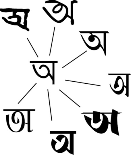
হরফ হল চরিত্র এবং হরফচিত্র হল সেই হরফের চেহারা। হরফ বিমূর্ত কিন্তু হরফচিত্রের দৃশ্যমান রূপ আছে। এবং দুটোই লিপির ক্ষুদ্রতম এককের, তবে সেই এককের একটা মান থাকা চাই। প্রথমটিকে ইংরেজিতে character বলা হয় আর দ্বিতীয়টিকে glyph। হরফ দিয়ে কথার অন্তর্নিহিত সজ্জা বা অন্বয় বোঝা যায় আর হরফচিত্র দিয়ে বোঝা যায় লিখলে বা ছাপালে কথাটি দেখতে কেমন হবে। উদাহরণ হিসেবে বলা যায় অ, যা বাংলা বর্ণমালার প্রথম স্বর, বা ক, যা বর্ণমালার প্রথম ব্যঞ্জন, আদতে একেকটি মান-সম্পন্ন হরফ, যার চরিত্র আছে, স্বভাব আছে এবং লিপিতে ভূমিকা আছে। এখন সেই হরফের চেহারার রকমফের হতে পারে। আকারে ছোট হতে পারে, বড় হতে পারে; দেখতে মোটা হতে পারে বা সরু; সোজা-দাঁড়ানো হতে পারে, রোমান হরফে যেমন হয়, আবার হেলানো হতে পার, ইটালিক হরফে যেমন হয়। নিরাভরণ হতে পারে, পাইকা বেঙ্গলিতে যেমন, আবার আলঙ্কারিক হতে পারে, রূপশ্রীতে যেমন হয়। হরফচিত্রের বোল্ড-ইটালিক হতে পারে, হরফের ক্ষেত্রে সেটা একদমই হয় না।
একটি হরফের অনেকগুলো হরফচিত্র থাকতে পারে। বাংলায় যেমন র, রেফ এবং র-ফলা আদতে একই হরফ, কিন্তু পারিপার্শ্বিকতায় আলাদা-আলাদা হরফচিত্র এবং সেটি নির্ধারিত হয় হরফটির প্রতিবেশের ওপর। 'গু' বাংলায় সাধারণত দুইভাবে লেখা হয়, গ-এর নিচে পুটলি পাকিয়ে এবং নীচে পরিষ্কার হ্রস্ব উ-কার দিয়ে—এখানেও হরফচিত্রের রকমফের। আবার একটি হরফচিত্রের ভেতর অনেক হরফ থাকতে পারে। বাংলায় জোড়া-হরফ প্রায় সবসময় হরফচিত্র, কিন্তু যতগুলো হরফের জোড়া, ততগুলো হরফের সমাহার। সিসার টাইপে বা লাইনোটাইপে সবই হরফ এবং হরফচিত্রের মিশেল; টাইপরাইটারে গুটিকতক হরফ বাদে বাকি সব হরফচিত্র, যার একাধিক জুড়ে হরফ বা হরফচিত্র লেখা হয়। ইউনিকোডের বাংলা ব্লকে (U+0980...U+09FF) যা আছে তার সবই হরফ; একটি ইউনিকোড ফন্টে হরফচিত্র থাকে ব্যক্তিগত ব্যবহারের ক্ষেত্রে (Private Use Area)।
১৫ই নভেম্বর ২০২১ | 15 November 2021
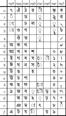
১৯৮৭ সালে, ভারতে যখন ডিপার্টমেন্ট অব ইলেক্ট্রনিক্স ইন্দীয় ভাষাগুলোর জন্য কোডপেজ নিয়ে কাজ করছে, বাংলাদেশ সরকার কম্পিউটারে বাংলা ভাষা বাস্তবায়ন কমিটি তৈরি করে। কিন্তু ১৯৯২ পর্যন্ত কাজ তেমন কিছুই হয়নি। ততদিনে ভারত সরকারের কোডপেজ তৈরি এবং তার ওপর ভিত্তি করে ইউনিকোডের বাংলার ছকও প্রকাশিত হয়ে গেছে। ১৯৯২ সালের এপ্রিলে বাংলাদেশ প্রকৌশল বিশ্ববিদ্যালয়ের কম্পিউটার বিজ্ঞান ও প্রকৌশল বিভাগের তৎকালীন প্রধানকে দায়িত্ব দেওয়া হলে সে-বছরের আগস্টের মধ্যে কোডপেজের একটি খসড়া দাঁড় করানো হয়। পরের বছর জুনে কমিটির অনুমোদনের পর, জুলাইয়ে বাংলাদেশ কম্পিউটার কাউন্সিলের অনুমোদন পায় কোডপেজটি। কাগজপত্র পরের মাসের শুরুতে বাংলাদেশ স্ট্যান্ডার্ডস অ্যান্ড টেস্টিং ইন্সটিটিউশনে পাঠানো হয়, কিন্তু মাসের শেষের দিকে কোডপেজটি সরকারি সিলমোহর পেতে ব্যর্থ হয়। ১৯৯৪ সালে বাংলাদেশের মান সংস্থা বিএসটিআই আবার কম্পিউটার কাউন্সিলকে দায়িত্ব দেয় বাংলা কোডের তালিকা প্রণয়নের এবং ১৯৯৫ সালে বাংলাদেশে প্রথম অনুমোদিত বাংলা কোডের তালিকা প্রকাশ হয় BDS 1520:1995 নামে, যা আদতে হরফ (character) নয়, বরং হরফচিত্রের (glyph) এনকোডিং।
বাংলাদেশে বিশেষত অ্যাপেল ম্যাকিনটোশে বাংলায় প্রথম লেখা হয় ১৯৮৪ সালে এবং এর পর থেকে ম্যাক বা উইন্ডোজে বাংলা লেখার সব প্রোগ্রামই ছিল হরফচিত্র- বা ফন্ট এনকোডিং-ভিত্তিক। আর তাই ১৯৯৫-এর কোডের তালিকা বিশুদ্ধভাবে হরফচিত্র-ভিত্তিক এবং এ-কারণেই ১৯৯৩-এর প্রচেষ্টা অনুমোদিত হয়নি, যদিও এটা খানিকটা সীমাবদ্ধতা সত্ত্বেও হরফ-ভিত্তিক একটি তালিকা ছিল। প্রতিটি ব্যঞ্জনের দু-টি কোড ছিল—একটি সাধারণ হরফ, আরেকটি জোড়া-হরফের সংযুক্তির রূপ; কিন্তু একটা সংযুক্তি চিহ্ন দিয়েই এই ব্যাপারটা এড়ানো যেতে পারত, ইউনিকোডে যেমন হয়েছে। এর পরে আরও তিনটে কোডপেজের অনুমোদন দেওয়া হয়েছে — ২০০০, ২০১১ এবং ২০১৮ সালে; সরকারি ভাষায় এই তিনটে হল ১৯৯৫ সালের কোডপেজের সংস্করণ, কিনতু সবগুলোই প্রধানত সে-সময়ের ইউনিকোডের বাংলার ছকের প্রতিলিপি।
In 1987, when India's Department of Electronics was busy working on a codepage, the Bangladesh government set up a committee on the implementation of Bengali on the computer system. Almost nothing moved until 1992. India’s ISCII and the Unicode Bengali block based on ISCII had already been published. In April that year, the then head of the computer science and engineering department at the Bangladesh University of Engineering and Technology was given the task of working out a code set. A framework was readied by August that year. On approval of the set in June 1993, the Bangladesh Computer Council approved the code set in July. It was then sent to the Bangladesh Standards and Testing Institution early August that year, but the code set fell through later that month. The Standards and Testing Institution in 1994 asked the Bangladesh Computer Council again to work out a code set and the new table approved by the Bangladesh government came out in 1995 — BDS 1520: 1995 — which was a repertoire of glyphs, set in a certain scheme, but not a set of characters, which a codepage is.
A system to compose Bengali text first came out on Apple Macintosh in Bangladesh in 1984 and all subsequent systems, on Mac or Windows, invariably used one font encoding or another. This perhaps was the reason the 1995 Bangladesh scheme was purely based on font encoding and this was also the reason the 1993 scheme, which was a codepage limitations, failed to obtain the approval. The 1993 scheme, as in the accompanying table, provided for two sets of consonant characters, the main form and the dependent form, which could have been avoided by the employment of a character, as it happened in Unicode. Bangladesh issued three more codepages, or revisions of the first one as the government calls them, in 2000, 2011 and 2018, but they all are essentially the Bengali Unicode block of the time.
৮ই নভেম্বর ২০২১ | 8 November 2021
হরফ যোজনার কাজে হরফের ভাঁড়ার প্রয়োজন। সেটার আবার প্রযুক্তিভেদে রকমফের। সিসার টাইপে যেমন কেস-ভরতি হরফ, টাইপরাইটারে তেমন সারিতে সাজানো হরফের হাতুড়ি। আর কম্পিউটারের ক্ষেত্রে কোডপেজ। কোডপেজ হল নির্দিষ্ট ক্রমে সাজানো হরফের সমষ্টি যা দিয়ে কয়েকটি ভাষার বর্ণমালাকে এক ছকে বেঁধে ফেলা যায়; যেমন, বঙ্গলিপির ক্ষেত্রে বাংলা, অসমিয়া, দেবনাগরী, মণিপুরী ইত্যাদি। প্রথম প্রধান, এবং এখনও পর্যন্ত গুরুত্বপূর্ণ, কোডপেজ ৭-বিটের আস্কি (ASCII, American Standard Code for Information Interchange) ১৯৬৩ সাল থেকেই ছিল, যদিও এই নামে নয়। তখন এর নাম ছিল ASA X3.4-1963। বাংলার জন্যও এমন একটি কোডপেজের প্রয়োজন ছিল, বস্তুত প্রতিটি ভাষার লিপির জন্যই এই প্রয়োজনটা থাকে। বাংলার প্রথম কোডপেজটি তৈরি হয় ১৯৯১ সালে — ভারতীয় মান BIS 13194:1991। এটি তৈরি করে ডিপার্টমেন্ট অব ইলেক্ট্রনিক্স, ১৯৮৬ থেকে ১৯৮৮ পর্যন্ত কাজ করবার পর। এর পোশাকি নাম ভারতীয় সূচনা অন্তর্বিনিময় সংহিতা মান (Indian Standard Code for Information Interchange), সংক্ষেপে ইস্কি (ISCII)। প্রচেষ্টার সঙ্গে জড়িত ছিল C-DAC বা Centre for Development of Advanced Computing।
এটি ইন্দীয় ১০টি ভাষা লেখবার জন্য তৈরি করা এবং এর কাঠামো দেবনাগরী লিপির ওপর ভিত্তি করে বানানো; অন্য ভাষার লিপির হরফগুলো মান মেপে প্রয়োজনমাফিক সেই কাঠামোর ওপর বসিয়ে দেওয়া। ইস্কির দুই ধরনের মান ছিল — ৭-বিট এবং ৮-বিটের, যা আবার ৭-বিটের কোডসেট আস্কির ২৫৬ ঘরের ওপরের ১২৮ ঘরে বসানো, যেন একইসঙ্গে ইংরেজি এবং ইন্দীয় ভাষার লিপিগুলো লেখা যায়। এর ওপর ভিত্তি করেই ১৯৯১-এর অক্টোবরে প্রকাশিত হয় ইউনিকোডে বাংলার হরফের প্রথম ছক। কিন্তু তথ্যের অন্তর্বিনিময় এবং দুয়েকটি সফটওয়্যার যেমন আই-লিপ (iLeap) এবং কিছু রাষ্ট্রীয় এবং রাজ্য সরকারের কাজ ছাড়া ইস্কি কোডপেজ, বিশেষত পশ্চিমবঙ্গে, আর কেউই মানেনি। পরে ইস্কিতে খানিকটা পরিবর্তন আনা হয়েছিল। তবে ইউনিকোডের অবশ্যম্ভাবিতার পর ইস্কি আর সাধারণ ব্যবহারে আসবে না বলেই মনে হয়।
Text composition requires an array of letters and this array varies keeping to the technology used. In hot metal composition, it was cases with boxes holding lead sorts. In typewriters, it was a string of hammers with protruding letters on the head. In computers, it is a long array of characters, used to write several languages that use a similar script. The Bengali script, for an example, is used to write Bengali, Assamese, Devanagari, Manipur, etc. The first major, and still important, such code page is the 7-bit ASCII (American Standard Code for Information Interchange), in use since 1963, which was then called ASA X3.4-1963. The Bengali script, or scripts of any other languages for that matter, needed a codepage. The first Bengali codepage — BIS 13194: 1991 — was designed by India’s Department of Electronics, based on the work that spanned from 1986 to 1988. C-DAC, or the Centre for Development of Advanced Computing, was a partner in the development of the codepage, formally known as the Indian Standard Code for Information Interchange,
The codepage, based primarily on Devanagari, provides for characters of 10 Indic languages, with characters of other languages mapped onto Devanagari characters. It had two versions — 7-bit and 8-bit, which was the 7-bit scheme set on the higher ASCII portion, the upper 128 of the 256 codepoints, so that text using both Latin and Indic characters could be composed simultaneously. The first Unicode Bengali chart, which came out in October 1991, was based on ISCII. But for information interchange, a handful of software such as iLeap and some public purposes, the scheme was hardly used in West Bengal. Some changes were made in the ISCII scheme later. But it hardly stands any chance to get back in use when Unicode has become so pervasive.
২রা নভেম্বর ২০২১ | 2 November 2021
লাতিন হরফগুলি যেমন একটি অদৃশ্য রেখার ওপর দাঁড়িয়ে থাকে, বাংলায় ঠিক তার উলটোভাবে বেশিরভাগ ক্ষেত্রে মাত্রা থেকে ঝুলে থাকে, আর নীচে এসে ভূমিরেখার কাছাকাছি, কখনো ওপরে কখনো-বা নীচে গিয়ে শেষ হয়। যাঁরা কম্পিউটারে হরফে নকশা করেন বা অনেক পুরোনো দিনে হরফের নকশা করতেন, তাঁদের এই বিষয়গুলো মাথায় রাখতে হত। হরফের নকশায় হরফ সবসময়ই একটা চৌখুপিতে বসানো থাকে। এর চারধারের দাগগুলো দেখা যায় না, আমরাও তা-নিয়ে চিন্তা করি না। এসব নকশাকারের কাজ, তাঁদের মাথাব্যথা।
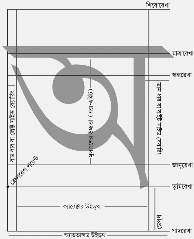
এরকম একটা চৌখুপির একদম ওপরের রেখার নাম শিরোরেখা। পরেরটা হল মাত্রারেখা; এই মাত্রারেখা হাতে-গোনা কয়েকটি হরফ বাদে আর সব ক্ষেত্রে দৃশ্যমান। এর পরেরটা হল স্কন্ধরেখা, অনেক হরফের কাঁধ ছুঁয়ে যায়। তার পরেরটা জানুরেখা, যেখানে অনেক হরফের মূলাংশের শেষ; লাতিন হরফের নকশার আলোকে জানুরেখা থেকে স্কন্ধরেখার উচ্চতাকে বাংলায় এক্স-হাইট বিবেচনা করে যেতে পারে। এর পরেরটা হল ভূমিরেখা, যেখানে বেশিরভাগ হরফের শেষ। সবচেয়ে নীচেরটা পাদরেখা, নিয়মমতো এর নীচে জোড়া-হরফের নীচের অংশ, উ-কার বা ঋ-কার যেতে পারে না। হরফের মূল নকশার দু-দিকে, মাত্রা-সহ বা ছাড়া, খানিকটা জায়গা থাকে — বাম ধারের নাম লেফ্ট সাইড বেয়ারিং আর ডান ধারের নাম রাইট সাইড বেয়ারিং। সাইড বেয়ারিং বেশ গুরুত্বপূর্ণ এ-কারণে যে এর একটু কম-বেশি হলেই পড়তে অসুবিধা হবে। মূল হরফের প্রস্থকে ক্যারেক্টার উইড্থ এবং সাইড বেয়ারিং-সহ প্রস্থকে অ্যাডভান্সড উইড্থ বলে। ভূমিরেখার সর্ববামের বিন্দুকে রেফারেন্স পয়েন্ট বলা হয়। নকশায় এই বিন্দুর সাপেক্ষে হরফ ডানে বিস্তৃত হয় বা ওপরে উঠে যায়।
এর প্রায় সবগুলো বিষয়ই সিসার হরফের নকশাকরদের মাথায় রাখতে হত। এখন যাঁরা কম্পিউটারে হরফের নকশা কাটেন, তাঁদেরও মাথায় রাখতে হয় এসব। এর বাইরেও আরও বিষয় আছে যেগুলো জরুরি, কিন্তু সংক্ষেপে সেসব বলবার জো নেই!
Latin letters stand up on an invisible line. In Bengali, the letters rather hang from the headstroke, or the headline, and reach down the baseline. All who design typefaces on computers deal with the issues and all who used to make the punch and the matrix used to deal with them. Every letter is placed inside a box, notionally. The boundaries are all imaginary and we hardly ever think of them. It is always for the type designers to take note of them.
The topmost line of such a box is called the topline, the next below is the headstroke, which is visible in most of the Bengali letters. The line next below, which touches the shoulder of letters, is called the shoulder line. The next below, down the letters where the main portion of most of the letters ends, is called the knee line. The height from the knee line to the shoulder line could be called the X-height of Bengali letters. The next below is the baseline, where most of the letters end. The one at the bottom is the footline. Keeping to the general rule, the second of the conjunct letters or the vowel markers below known as kars cannot go below the footline. The blank space left fore and aft the main design of the letter, with the headstroke or without, are side bearings, which play an important role in the legibility of the face. The width of the main character is the width and the width with the side bearings is the advanced width. The leftmost point of the baseline is the reference point, from where the design extends rightwards and upwards.
All metal typecasters had to deal with the issues. And all who now design faces on computers also deal with them. There are other issues in type design, but it is difficult to tell them in short.
২৫শে অক্টোবর ২০২১ | 25 October 2021
হরফের আলোচনায় বিশেষ কিছু শব্দের প্রয়োজন, তা সে সিসার হরফই হোক বা কম্পিউটারের নকশায়। এই নামগুলোর প্রায় সবটাই ইংরেজিতে। বিচল বাংলা হরফ ঢালাইয়ের শুরুর দিকে কী বলা হত, তার কোনো হদিশ পাওয়া যায় না। যেসব বাঙালিরা হরফের ছেনি কাটতেন তাঁদের কেউই বোধ করি আর বেঁচে নেই। তাই এগুলোর বাংলা নাম আদৌ ছিল কি না, জানা যায় না। সিসার একেকটি হরফ দেখতে আদতে এই নকশার মতো। পুরোটার উচ্চতা এক ইঞ্চির একটু কম, যদিও একসময় ঢালাইকর ভেদে এই মাপের হেরফের হত। যে উঁচু অংশ থেকে কাগজে কালি লেগে ছাপা হত, তার নাম ফেস (face)। ফেসের মাঝের ফাঁকা অংশের নাম কাউন্টার (counter)। টাইপের মাথা থেকে ফেসের উঠে যাওয়ার অংশের নাম বিয়ার্ড (beard) বা বেভেল (bevel)। এই বেভেলের উচ্চতার নাম ড্রাইভ ডেপ্থ (depth of drive)। ওপরের সমতল অংশের নাম শোল্ডার (shoulder)। নীচের তলের নাম ফুট (foot)। সামনে নীচের দিকের খাঁজের নাম নিক (nick)। সামনে থেকে পেছনের বা টাইপের নীচ থেকে ওপরের নাম বডি (body), যা আদতে টাইপের মাপ। ডান থেকে বামের প্রস্থের নাম উইড্থ (width) বা সেট (set)। আর, টাইপের দেহের নাম স্টেম (stem) — শ্যাংকও (shank) বলা হয়ে থাকে একে। নিকের কারণে যিনি কম্পোজ করেন, তিনি না দেখেই বুঝতে পারেন টাইপের নীচের এবং সামনের দিক কোনটি।
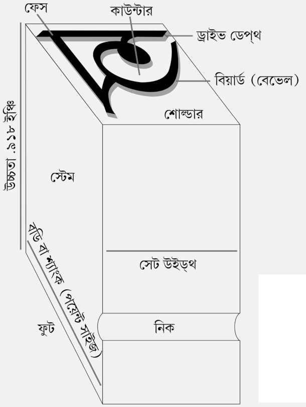
হরফর নকশার এই মাপ বা হিসেব করা কিন্তু ঢালাইকরের কাজ, বিশেষত যখন হাতে ঢালাই হত। পরে ঢালাইয়ের যন্ত্র এসে গেলে, একটা ছাঁচ বা ম্যাট্রিক্স বসিয়ে নিলেই কাজ চলত।
Any discussions of types would bring in some terms, whether they relate to metal types or character designs on the computer screen. The terms are mostly in English. There could be some Bengali terms in early days of the Bengali typecasting, but they may have left no trace. The Bengalis involved in typecasting have all died and we are, therefore, left with no Bengali terms. A metal type sort looks like what is in the picture. The height to paper is less than an inch although this measure varied depending on the caster. The surface that makes the letter on the paper is face. The opening cut out within the face is the counter. The raised wall along the face is either the beard or the bevel. The height of the beard is the depth of drive. The lowered plane around the letter is the shoulder. The bottom of the sort is the foot. The channel cut out in the front is the nick and the compositors could tell the front and the bottom of the sort by feeling the nick. The height of the sort is the body, or the size of the face. The distance from the right to the left is the width or the set. The physical mass holding everything is the stem, or the shank.
The caster used to keep all this into account, especially in the days of handcasting. After the invention of the mechanical caster, a matrix was enough.
১৮ই অক্টোবর ২০২১ | 18 October 2021
বাংলা ছাপাইয়ের শুরুর দিকে মুদ্রাকরদের কাজ শিখতে হত হাতে-কলমে, গুরুর হাত ধরে। এই বিষয়ে ইংরেজিতে অনেক বইপত্র থাকলেও বাংলায় তেমন কিছু ছিল না। বিহারী লাল ঘোষ তাঁর পাঁচ বছরের কাজে অভিজ্ঞতায় বুঝতে পারেন যে ‘অধিকাংশ কর্ম্মাচারী মুদ্রাযন্ত্র সম্পর্কীয় কার্য্যকর্ম্ম সম্পর্কে সম্পূর্ণ অনভিজ্ঞ।’ এ বিষয়ে ‘কোন পুস্তক এপর্য্যন্ত প্রকাশিত হয় নাই বলিয়া’, তিনি একটি বই লেখেন — প্রিন্টার্স গাইড্: কম্পোজিটার, ডিস্ট্রিবিউটার, প্রেসম্যান এবং অপর সাধারণের জন্য। আখ্যাপত্রে ইংরজিতে ছাপা আছে — The Printer’s Guide for the use of Compositors, Distributors, Pressman and Others। প্রথম সংস্করণটি ছাপা হয়েছিল কলকাতা থেকে ১২৯৩ সনের অগ্রহায়ণে, অর্থাৎ ১৮৮৬ খ্রিস্টাব্দের ডিসেম্বরে। কী করে কম্পোজ করতে হয়, কী করে প্রুফ দেখতে হয়, কী করে ইম্পোজিশন করতে হয় — এইসব বিষয়ের আলোচনা, সঙ্গে বাংলা ও ইংরেজি কেসের নকশা। দ্বিতীয় সংস্করণ বেরিয়েছিল কি না জানা যায় না, তবে বইটি যে প্রথমদিকের একটি, তা নিশ্চিতভাবে বলা যায়।
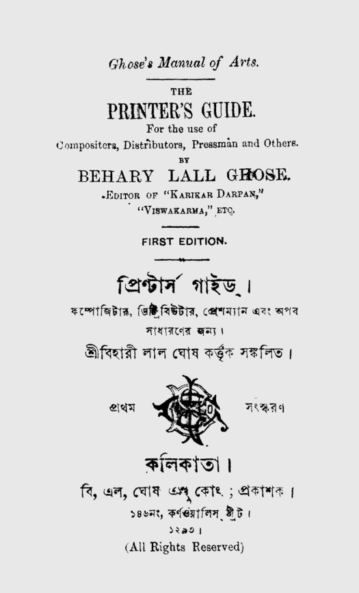
In the early days of Bengali printing, people used to learn the trade with their masters. Books on the trade were available in English, but there were almost none in Bengali. Behary Lall Ghose, having been in the trade for five years, could feel that ‘most of the workers in printing presses were adequately conversant with the trade’ and ‘there had been no books on this’ till then. He wrote a book — ‘The Printer’s Guide: for the use of Compositors, Distributors, Pressman and Others.’ The first edition was printed in Kolkata in Agrahayan 1293, Bengali San, which is December 1886. The book deals with how to compose text, how to make proof corrections and how to do the imposition. The book contains the diagrams of the Bengali and the English typecases. It is difficult to establish if it had run to a second edition, but it certainly was one of the initial works of the kind.
১১ই অক্টোবর ২০২১ | 11 October 2021
টাইপ ফাউন্ড্রি দেখতে আর সব দোকানের মতোই। সাইনবোর্ড পেরিয়ে ভেতরে ঢুকতেই ঠিক যতটুকু প্রয়োজন ততটুকু আলো; একটি টেবিল; ওপরে সিলিং ফ্যান। টেবিলের ওপর একটি টেলিফোন, রেজিস্ট্রি বুক কতটা কী বিক্রি হচ্ছে তার হিসেব রাখবার জন্য। আর একটি বা দু-টি হরফের নমুনার বই যেখানে সব ছাঁদের সব মাপের হরফে কয়েকটি বাক্য লেখা থাকে, সঙ্গে ছাঁদের নাম এবং মাপ — যেমন, গণবাংলা ১৮ পয়েন্ট বা পাইকা ১২ পয়েন্ট কিংবা রূপশ্রী ২৪ পয়েন্ট। ক্রেতা, যাঁরা আদতে ছাপাখানার লোক, তাঁরা এই নমুনা দেখে হরফের অর্ডার দিতেন।
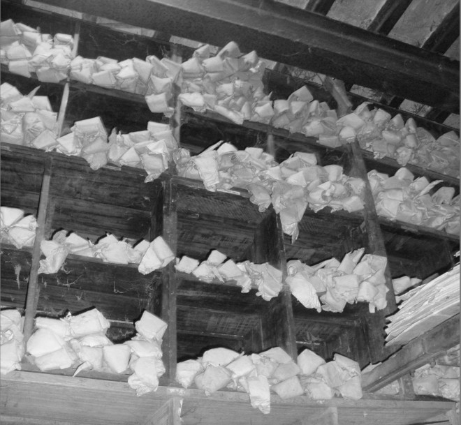
বেশিরভাগ ফাউন্ড্রিতে ঢালাইখানা এবং সিসার হরফ রাখার ঘর লাগোয়া, অন্তত এরকমটাই ছিল একসময়, এবং সেটা সাধারণত মাঝের একটা দরজার ওপাশে। সারি সারি কাঠের তাক। দুই তাকের মাঝ দিয়ে কোনোরকমে হাঁটা যায়। দুয়েকটি তাকে আবার দেরাজ। ওপরের দিকের তাক থেকে টাইপ নামানোর জন্য একটা মই। এই তাকগুলোয় সিমেন্টের ব্যাগের যে-মোটা কাগজ হয়, তা দিয়ে বানানো চোঙামতো ঠোঙা। শত শত। প্রতিটি ঠোঙার ওপরে একটি হরফ, ছাঁদের নাম এবং মাপ। ভেতরে সেই ছাঁদের এবং মাপের সিসার হরফ। দু-ছটাক আ-কার অর্ডার দিলে একজন সেটা খুঁজে বের করে ঠোঙা খুলে মেপে দেয়। সংখ্যায় অর্ডার দিলে, গুনে দেয়। সঙ্গের ছবিটি বছর পনেরো আগে প্রায় বন্ধ হয়ে যাওয়া পুরান ঢাকার পাটুয়াটুলির মদিনা টাইপ ফাউন্ড্রির হরফ রাখার ঘরের।
Type foundries are mostly all like other shops. A few steps past inside the door, with a sign overhead, the room is lighted to the need — a table, with a ceiling fan turning over the head, a telephone on the table, a registry book that keeps count of the sales. There would be a type specimen book or two, with printed samples of all typefaces available, the names and their size — Ganabangla 18pt or Pica 12pt or even Rupashri 24pt. Buyers, basically people of print shops, used to order types after choosing faces from the specimen book.
In most type foundries, the places where types were cast and stored were adjacent, a few steps outside the other door. There would be rows of racks, leaving room in between enough for someone to move. Some of the racks had drawers. There could be a ladder to reach the upper shelves. The shelves used to hold cones made of paper from cement bags, each with the sort of a face and the size written on it. Inside were the individual lead sorts of the size. A man used to find out the cones needed and weigh the sorts if the order was given by weight and count them if the order was by number. The accompanying photograph shows the store of the Madina Type Foundry, which closed down about a decade and a half ago, at Patuatuli in Dhaka.
৬ই অক্টোবর ২০২১ | 6 October 2021
সিসার বিচল হরফের ছাপাখানায় বাংলা কম্পোজের জন্য হরফ রাখা হত কাঠের তৈরি চারটি ডালায়— কোলের কাছে একটি, ওপরে একটি, হাতের ডান দিকে একটি, আর বাম দিকে একটি। পুরোটা মিলিয়ে টাইপ কেস, আর তাতে অনেকগুলো ছোটো-বড়ো খোপ, অর্থাৎ কেসবক্স, যাকে একটু পণ্ডিতি বাংলায় অক্ষরাধারের কোষ্ঠ বলা যায়। কোলের কাছের কেসে খোপের সংখ্যা ছোটো-বড়ো মিলিয়ে ৭১টি। ইংরেজিতে এই কেসের নাম লোয়ার কেস, যেখানে ছোটো হাতের হরফ রাখা হত; আর এ-কারণেই ইংরেজির ছোটো হাতের হরফকে লোয়ার কেস বলা হয়। ওপরের কেসে ১২৮টি সমান মাপের খোপ; ইংরেজিতে আপার কেস, যেখানে বড়ো হাতের হরফ রাখা হত; আর এ-কারণেই ইংরেজির বড়ো হাতের হরফকে আপার কেস বলা হয়। সাধারণত ছোটো হাতের ইংরেজি হরফকে ইংরেজিতে small letter এবং বড়ো হাতের হরফকে capital letter বলা হয়। ডানের কেসে সমান মাপের খোপের সংখ্যা ১২৮টি; বামের কেসেও তাই। সব মিলিয়ে ৪৫৫টি খোপ। তবে বাংলা সিসার হরফের সংখ্যা এর চেয়ে বেশি, মোটামুটিভাবে ৫৬৩ বা তারও বেশি।
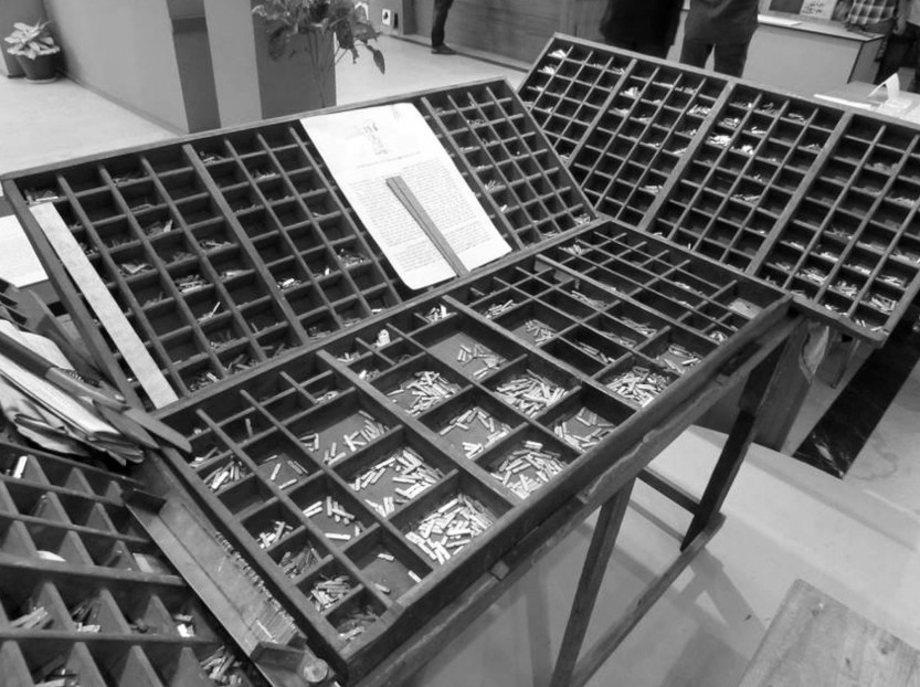
এখন যেমন দ্রুত টাইপ করতে হলে কম্পিউটারের কি-বোর্ড আঙুলের ডগায় মুখস্থ করতে হয়, তখন কম্পোজিটরকে চারটি ডালার বিন্যাসও তেমনিভাবে মনে রাখতে হত। কারণ তাঁর বাম হাতের ধরা থাকত কম্পোজিং স্টিক আর ডান হাতে দুই আঙুলে প্রায় না দেখে তুলে আনতে হত খোপে পড়ে থাকা দরকারের হরফটি। কম্পোজিং স্টিকে একের পরে এক হরফ সাজিয়ে লাইন এবং লাইনের পর লাইন সাজিয়ে পাতার জুড়ে হরফ সাজানো হত। কম্পোজিং স্টিকে যেহেতু কয়েক লাইনের বেশি হরফ সাজানো যেত না, তাই স্টিকটি প্রায় ভরাট হয়ে গেলে লাইনগুলো সরিয়ে রাখা হত।
Four wooden cases — one in the lower front, one in the upper front, one in the right and the other in the left — used to hold the sorts, or pieces of hot metal type, that were employed in presses for Bengali text composition. The cases had compartments. The one in the lower front had 71 compartments and the upper front one had 128 compartments. In cases used for English text composition, capital letters used to go in the upper case, which is why capital letters are called upper case letters; and small letters used to go in the lower case, giving them the name of lower case letters. The right and the left case had 128 equal-sized compartments. There were 455 compartments in all to hold 653 or more sorts.
Typing the way it should be requires people to learn the computer keyboard outlay by the finger. In those days, compositors used to learn the distribution of types in the cases in a similar manner. The compositor used to hold the composing stick in the left hand and pick up the types from the boxes with the right hand, without looking at the outlay, to set letter after letter to make lines and then pages. When the composing stick was almost full, the lines were transferred to a galley.
২৮শে সেপ্টেম্বর ২০২১ | 28 September 2021
পাড়ার প্রেসের ম্যানেজার দ্বিজেনবাবু আপন মনে কীসব যেন বকছেন! কাছাকাছি গিয়ে শোনা গেল যে দ্বিজেনবাবু বলছেন — দু-শো জ-য়ে রেফ, ছ-শো অনুস্বার, এক-শো মূর্ধন্য ণ-য়ে ড, দু-শো ক-য়ে রেফ। হিমানীশ গোস্বামীর গল্পের দ্বিজেনবাবু আদতে ঝামেলায় আছেন; কারণ, কমিউনিস্টদের লেখা ছাপতে গেলে এ-হরফের সাটগুলো বেশি লাগে— বুর্জোয়ার জ-য়ে রেফ, পিকিংয়ের অনুস্বার, লণ্ডনের মূর্ধন্য ণ-এ ড, আর নিউইয়র্কের ক-য়ে রেফ। তা ছাড়া এবং-এর অনুস্বার আছে। ছ-শোয় হয়তো কুলোবে না। এরপর আছে হংকং, ইয়াং-সিকিয়াং। অন্তত হাজার খানেক অনুস্বার দরকার। অনেক সময় আবার এবং কেটে ও বা আর করতে হত, অনুস্বার না পাওয়া গেলে। প্রবন্ধে বুর্জোয়া কথাটা থাকবেই — প্রতি তিন লাইনে একটা বুর্জোয়া, ষোল পাতার ফর্মায় আটচল্লিশটা জ-য়ে রেফ, অন্তত তিন-চার ফর্মার জন্য প্রস্তুত থাকতে হয়, তাই শ দুই জ-য়ে রেফের প্রয়োজন।
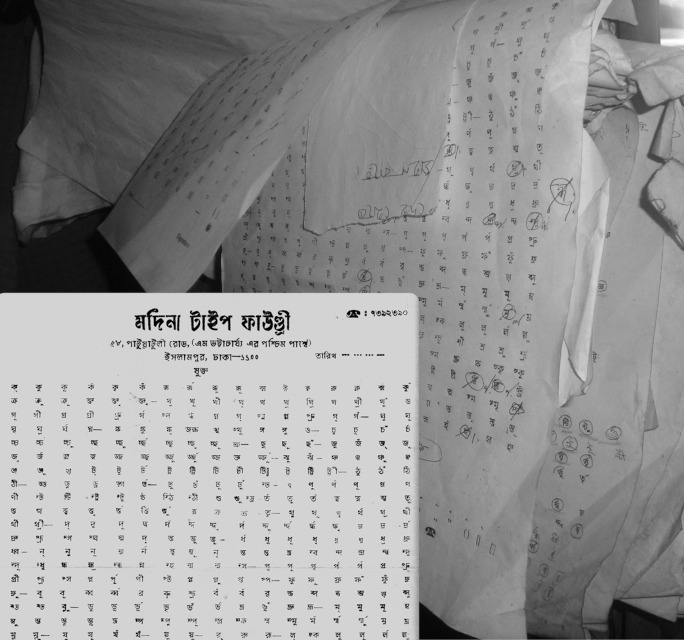
কিন্তু একবার প্রয়োজনমাফিক হরফের সাট কিনে ফেলার পর, দ্বিজেনবাবু মনে মনে নতুন সাটের হিসেব তো ঝালিয়ে নিচ্ছেন, কিন্তু ঢালাইখানায় গিয়ে প্রয়োজনীয় হরফের অর্ডার দেবেন কী করে? হরফের ঢালাইখানায় অর্ডার শিট বলে একটি পাতা থাকত যেখানে ছাপা থাকত সাটের সব হরফ। সঙ্গের ছবিটি বছর পনেরো আগে প্রায় বন্ধ হয়ে যাওয়া পুরান ঢাকার পাটুয়াটুলির মদিনা টাইপ ফাউন্ড্রির জোড়া-হরফের অর্ডার শিট। তখনও পর্যন্ত খান তিনেক ফাউন্ড্রি টিকে ছিল ঢাকায়। যার যে-হরফটির দরকার তার চারিদিকে গোল্লা এঁকে পাশে পরিমাণ লেখা হত, টাইপের ওজনে বা সংখ্যায়। বছর তিরিশেক আগেও, অর্ডার দেওয়ার পরে কয়েক দিন অপেক্ষা করতে হত টাইপ পেতে, কারণ ঢালাইখানার লোকেরা কাজ করে কুলিয়ে উঠতে পারতেন না।
Mr Dwijen, the manager of the printing press in the neighbourhood, is talking loud to himself. A few steps closer and he is heard murmuring — two hundred sorts of ja with reph (জ-য়ে রেফ), six hundred sorts of anusvar (অনুস্বার), a hundred sorts of mudhanya ṇa with ḍa (মূর্ধন্য ণ-য়ে ড) and two hundred sorts of ka with reph (ক-য়ে রেফ). Mr Dwijen, the character of a story that Himanish Goswami wrote, is in trouble. He needs all these sorts, pieces of hot metal types, to print articles written by the communists — ja with repha to print bourgeois (বুর্জোয়া), anusvar to print Peking (পিকিং), murdhanya ṇa with ḍa to print London (লণ্ডন) and ka with reph to print New York (নিউইয়র্ক). He also needs the anusvar sort to print ebang (এবং, the word for ‘and’). He still doubts if six hundreds of it would be enough. He would also need to print Hong Kong (হংকং) and Yang Si-Kyang (ইয়াং-সিকিয়াং). He might need a thousand of it. If the anusvar sort is not at hand, he would change ebang (এবং) to o (ও) or ar (আর). The article would certainly have the word bourgeois, once in three lines, which would make 48 of ja with reph for an octavo. He would need to have enough of it to print three to four octavos. He may need two hundred sorts of ja with reph.
He is rehearsing the count after having bought a set of types. But how would he place the order at the foundry? Foundries those days had sheets of papers with all sorts, or types, printed on them. The photograph here is one such sheet from the papers of a foundry, Madina Type Foundry that ran at Patuatuli in Old Town of Dhaka. Three foundries were in operation then. A circle would be drawn around the sort and the requirement would be written, by the number or the weight needed. It would take a few days for an order to be processed. The people at the foundries then had a busy time completing orders.
২২শে সেপ্টেম্বর ২০২১ | 22 September 2021
শব্দমধ্যস্থিত সন্ধি যেমন হয়, শব্দের সীমানা পেরিয়েও সন্ধি হয়। এ ধরনের সন্ধিকে বাহ্যিক সন্ধি বলে। বিলেতে আঞ্চলিক ইংরেজির কিছু ক্ষেত্রে যেমন the idea of it কথাটিকে the idea(r) of it বলা হয়, একটি লিঙ্কিং আর (linking r) যোগে। কিংবা ফরাসিতে যাকে লিয়েজোঁ (liaison) বলে — ফরাসিতে দুই ভাইয়ের (deux frères) ক্ষেত্রে প্রথম শব্দের শেষ ব্যঞ্জন বাদ দিয়ে উচ্চারিত হয় দ্যো ফ্রের, কিন্তু দুই জন পুরুষের (deux hommes) ক্ষেত্রে প্রথম শব্দের শেষ ব্যঞ্জন-সহ উচ্চারণ দাঁড়ায় দ্যো জ়োম-এ। বাংলা হরফে লেখা সংস্কৃত পুথিতে এ-ধরনের সন্ধির জানান দেওয়া হয় মাত্রার ওপরে ছোটো একটি অবগ্রহের মতো দেখতে চিহ্ন দিয়ে। এখনও পর্যন্ত এর দেখা পাওয়া গিয়েছে কেবল পুথিতেই — মানে, বাংলা হরফে লেখা সংস্কৃত পুথিতে।
এই চিহ্নের ব্যবহার আছে এমন একটি পুথি রাখা আছে ওড়িষার একটি জাদুঘরে; তার নাম ভাগবত, বাঁশ পাতায় লেখা। আঠারো শতকে বিশ্বনাথ চক্রবর্তীর লেখা স্তবমালা নামের আরেকটি পুথিতেও এর ব্যবহার দেখতে পাওয়া যায়—এ-পুথির প্রথম পাতার একটি শব্দবন্ধ স্তবমালানুজীবেন, আদতে স্তবমালা আর অনুজীবেন-র সন্ধি, বাহ্যিক সন্ধি; আর তাই ল-এর আ-কারের ওপর ছোটো অবগ্রহের মতো একটি চিহ্ন। ‘বাংলা সন্ধি চিহ্ন’ বলে এই হরফটি ইউনিকোডের বাংলার তালিকার নতুন তিনটি সংযোজনের তৃতীয়; এর অনন্য পরিচয়-জ্ঞাপক মান 09FE। হরফটি তালিকায় ঢোকে ইউনিকোড মানের একাদশতম সংস্করণে, ২০১৮ সালে।
এই হরফের তালিকায় অন্তর্ভুক্তির প্রস্তাবে বলা আছে এটি দেখতে মাত্রার ওপরে অবগ্রহের মতো। সে কারণেই হয়তো ইউনিকোডের তালিকায় এর চেহারা অবগ্রহের মতো। ভাগবত পুথিতে এর চেহারা বাংলা সংখ্যা ২ (দুই) এর মতো আর রসিকানন্দের ভাগবতষ্টাকম্-এ সন্ধির এই চিহ্নটি দেখতে মাত্রা এবং চৈতন ছাড়া ই-এর মতো।
Sandhi, a process of sound changes, occurs not only at morpheme boundary but also at word boundary. The external sandhi, the one occurring at word boundary, is typical of some English dialects such as ‘the idea of it’, which is uttered with a linking r as in ‘the idea(r) of it’. Known as liaison in French, it is found in the phrase ‘deux hommes’, two people — or two men, to be precise — where the letter x pronounces as ‘z’ but is absent in the phrase ‘deux frères’, two brothers, where the letter x is silent. Such an external sandhi is flagged with an avagraha-like sign over the headstroke in Sanskrit codices written in the Bengali script. This has so far been signed only in codices of Sanskrit text written in Bengali letters.
A codex — ‘Bhāgabat’, written on bamboo leaves — sporting the sign is there in a museum in Odisha. The sign is also found in a codex named ‘Stavamālā’, written by Bishwanath Chakrabarti some time in the eighteenth century. The first leaf of the codex has the phrase ‘stavamālānujīvena’, an example of an external sandhi between stavamālā and anujīvena, signified with the avagraha-like sign over the headstroke of la and ā-kar. The Bengali sandhi is the third, having the value of 09FE, of the three latest additions to the Unicode Bengali code block, in the 11th version of the standard that came out in 2018.
The proposal for the encoding of the mark says that it looks like an avagraha, which has made it look like an avagraha in the Unicode standard. The mark in the Bhāgabat codex looks like the Bengali numeral 2 (two) and in Bhāgabataṣṭākam by Rasikananda like the Bengali vowel i (ই), without the headstroke and the flourish that goes upward.
১৫ই সেপ্টেম্বর ২০২১ | 15 September 2021
শব্দ সংক্ষেপণের জন্য বাংলার চিরায়ত হরফ হয় বিসর্গ নতুবা অনুস্বার। হালে অবশ্য ব্যাপারটা অনেকটাই পালটেছে, বিশেষত বাঙালি ইংরেজি শেখবার পর, যদিও ইংরেজদের হাত ধরেই বাংলায় ছাপার শুরু এবং, এমনকী, ইংরেজির অনুকরণে বাংলার যতিচিহ্নেরও শুরু। উনিশ শতকে হয়তো বেশ কম, কিন্তু বিশ শতকে, বিশেষত মধ্যভাগের পর, বই-পুস্তকের ছাপায় এবং, অবশ্যম্ভাবীভাবে শেষের দিকে, পত্র-পত্রিকায় সংক্ষেপক বিসর্গ বা অনুস্বারের জায়গা করে নিয়েছে ইংরেজির ফুল স্টপ, মার্কিনিদের মুখে পিরিয়ড, বাংলায় যা বিন্দু।
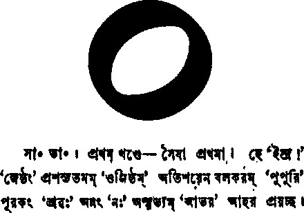
কিন্তু বাংলায় দেবনাগরীর শব্দ-সংক্ষেপণের জন্য ব্যবহৃত হরফের মাত্রার একটু নীচে বা মাঝ বরাবর গোল্লার ব্যবহারও আছে। ১৮৮৫ সালে কলিকাতার সত্যযন্ত্রে ছাপানো সত্যব্রত সামশ্রমি ভট্টাচার্যের সামবেদসংহিতা: কৌথুমী শাখা নামের বইয়ের সটীক বাংলা অনুবাদে এই সংক্ষেপণের গোল্লার দেখা মেলে। এই গোল্লা — ‘বাংলা সংক্ষেপণ চিহ্ন’ হল ইউনিকোডের বাংলার তালিকার নতুন তিনটি সংযোজনের দ্বিতীয়; এর অনন্য পরিচয়-জ্ঞাপক মান 09FD। হরফটি তালিকায় ঢোকে ইউনিকোড মানের একাদশতম সংস্করণে, ২০১৮ সালে।
The letter customarily used in Bengali to abbreviate words is either visarga or anusvara. This has, however, changed, especially after the Bengalis have learnt English although it is with the English that printing in Bengali began and Bengali punctuation marks are largely modelled on English punctuation marks. Minorly in the nineteenth century and majorly in the twentieth century, especially in the second half, in the printing of books and, predominantly towards the end of the century, in the printing of newspapers and periodicals, the full stop, or the period in US parlance, which is a dot in Bengali, has replaced visarga and anusvara in word abbreviation.
But a ring below the headstroke, or half down the letter height, has also been in use to abbreviate words. The use of the ring as a sign of abbreviation is found in a book, an annotated Bengali translation of ‘Sāmavedasaṁhitā: Kauthumī Śākhā’ by Satyabrata Samashrami Bhattacharya, printed at Satyayantra in Kolkata in 1885. This Bengali abbreviation sign, having the unique value of 09FD, is the second of the three latest additions that entered the Unicode Bengali code block in its 11th version in 2018.
৮ই সেপ্টেম্বর ২০২১ | 8 September 2021
সংস্কৃত ব্যাকরণে বলা হয় — স্বরম্ অনু ভবতি ইত্যনুস্বারঃ, অর্থাৎ স্বরের পরে বসে বলেই এর নাম অনুস্বার। বাংলায় অনুস্বার একটি হলেও, সংস্কৃতে এর বেশ রকমফের। শুদ্ধ অনুস্বার কেবল নাক দিয়ে উচ্চারিত হয়, বাগ্যন্ত্রের অন্য কোনো প্রত্যঙ্গ ব্যবহার করে নয়। অনুনাসিক ধ্বনির জন্য বাগ্যন্ত্রে অন্য প্রত্যঙ্গ নির্দিষ্ট। যজুর্বেদে আছে — মহাঁ ইন্দ্রো য ঽ ওজসা; এখানে চন্দ্রবিন্দুটি শুদ্ধ অনুস্বারের প্রকাশ এবং এর দেখা মেলে কেবল বৈদিক সংস্কৃততে। দেবনাগরীতে চন্দ্রবিন্দুর ব্যবহার করা হয় শুদ্ধ অনুস্বার বোঝাতে। এই ‘বাংলা হরফ বৈদিক অনুস্বার’ হল ইউনিকোডের বাংলার তালিকার নতুন সংযোজনের একটি। এর অনন্য মান 09FC। হরফটি তালিকায় ঢোকে ইউনিকোড মানের একাদশতম সংস্করণে, ২০১৮ সালে, আরও দুটি হরফের সঙ্গে।
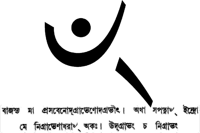
১৯২৬ সালে হাওড়া শহরের ‘পৃথিবীর-ইতিহাস’ মুদ্রা-যন্ত্রে ছাপানো দুর্গাদাস লাহিড়ী-সম্পাদিত কৃষ্ণ-যজুর্ব্বেদ-সংহিতার প্রথম খণ্ডে এই অনুস্বারের দেখা মেলে — বাংলা ঈশ্বর চিহ্নের ডান পাশে একটি হসন্ত, কিংবা বাংলা অনুস্বারের লেজ। সাধারণ অনুস্বার থেকে এইটে যে আলাদা তার উদাহরণ এই বইতেই আছে। যেহেতু বঙ্গলিপি সংস্কৃতেরও বর্ণমালা তাই এই হরফটি বাংলার তালিকায় ঢুকে পড়েছে, যদিও এর ব্যবহার দেখা যায় বাংলা হরফে কৃষ্ণ যজুর্বেদের তৈত্তিরীয় সংহিতা আর সামবেদের কৌথুমী সংহিতার সংস্কৃত ছাপায়। বইয়ের ছাপায় হরফটি দেখতে বেশ, কিন্তু ইউনিকোডের তালিকায় বাকি হরফের সঙ্গে ওজনে এর অমিল বেশি।
The Sanskrit grammar defines anusvara as a character taking place after vowels — svaram anu bhabati ityanusvāraḥ. Bengali has one anusvara but Sanskrit has its variants. A pure anusvara pronounces with the nasal cavity, not with any other parts of the speech organ. Parts of the speech organ are specifically used for nasalised sounds. The Yajurveda has a phrase — mahām̐ indro ya ’ ojasā — where m̐ signifies the enunciation of the pure anusvara, which is found only in Vedic text. In Devanagari, a candrabindu signifies the pure anusvara. This Bengali letter Vedic anusvara is one of the three latest additions to the Unicode Bengali code block; the unique value for the character is 09FC. The letter entered the block in the 11th version of the standard in 2018.
The Vedic anusvara is printed in a book by the name of ‘Kr̥ṣṇa-Yajurvveda-Saṁhitā’, edited by Durgadas Lahiri and printed at Prithibir-Itihas Mudra-yantra in Hawra in 1926. It looks like the ishwar sign with a hasanta, or the tail of the Bengali anusvara, to its left. That this is different from the usual anusvara is reflected in the text of the book. As Sanskrit is also written in the Bengali alphabet, it has become part of the Bengali script system, but has been found only in the Sanskrit text of the Taittiriya Samhita of the Yajurveda and the Kauthumi Samhita of the Samaveda. The letter perfectly blends in weight with the typeface used in the book, but it looks a bit odd as is printed in the Unicode Consortium code block.
১লা সেপ্টেম্বর ২০২১ | 1 September 2021
ইউনিকোডে বাংলা শুরু থেকেই আছে, যদিও একভাবে নয়। ১৯৯১-এর অক্টোবরে প্রকাশিত ইউনিকোডের প্রথম সংস্করণে বাংলা ছিল, কিন্তু বর্তমান মানে (ত্রয়োদশতম, মার্চ ২০২০) যেমনভাবে আছে তার থেকে কয়েকটি হরফ কম নিয়ে। এই সংস্করণে বাংলার ব্লক U+0980–U+09FF সম্বন্ধে মোট ১৩৪টি শব্দ, যার মোদ্দা কথা হল বেশিরভাগ হরফের আচরণের জন্য দেবনাগরীর হরফের আলোচনা দ্রষ্টব্য এবং কয়েকটি হরফ বিশেষভাবে বাংলার জন্য অন্তর্ভুক্ত। অ্যাডিসন-ওয়েসলির ছাপানো প্রথম খণ্ডে বাংলার ব্লকে একটি লিপিগত মুদ্রণ প্রমাদও আছে — য় দেখতে মূর্ধন্য ষ-এর নীচে বিন্দু; পরের সংস্করণ নাগাদ ইউনিকোডের কর্মকর্তারা অবশ্যা জেনে গিয়েছেন যে অন্তস্থ য়-এর পেট কাটা নয়। সাকুল্যে হরফ সংখ্যা ৮৯টি। খণ্ড-ত (ৎ) এবং অবগ্রহ (ঽ) নেই। এবং বর্তমানের মানের বিচারে পাঁচটি চিহ্ন অনুপস্থিত।
১৯৯৬ সালের জুলাইয়ে প্রকাশিত মানের দ্বিতীয় সংস্করণে হরফ সংখ্যা অপরিবর্তিত, কিন্তু আলোচনাটি খানিক বেশি; বলা আছে যে বাংলা হরফের আচরণ দেবনাগরীর হরফের মতো। এদিকে, তালিকায় খণ্ড-ত না থাকায় অনেকে ‘মহৎ’ লিখতে পারছিলেন না বলে বাংলাদেশে একটা শোর ওঠে। ওদিকে, আবার ইউনিকোডের বাংলা মান যেহেতু ১৯৮৮ সালের ভারতীয় সূচনা অন্তর্বিনিময় লিপি সংহিতার (Indian Script Code for Information Interchange) ওপর ভিত্তি করে করা, অনেকে এটাকে ভারতীয় কাজ বলে প্রচার করে এবং এ-থেকেও এক ধরনের বিরোধিতা তৈরি হয়। মানের চতুর্থ সংস্করণে (এপ্রিল ২০০৩) ইউনিকোড কর্মকর্তারা খণ্ড-ত লেখার উপায় বাতলান — ত + হসন্ত+ শূন্য-প্রস্থ যোজক; আর হসন্ত দিয়ে ত লিখতে হলে যোজকের জায়গায় শূন্য-প্রস্থ অযোজক। এই সংস্করণে অবগ্রহ ঢোকানো হয়। ওদিকে মানের ৪.১.০ সংস্করণে (মার্চ ২০০৫) খণ্ড-ত ঢোকানো হয়। পঞ্চম সংস্করণে, আদতে ২০০৯-এর অক্টোবরের ৫.২.০ সংস্করণে, গণ্ডা চিহ্ন ঢোকানো হয়। ২০১৪-এ জুনের সপ্তম সংস্করণে ঢোকে আঁজি চিহ্নটি। আর ২০১৮-এর জুনের একাদশতম সংস্করণে একসঙ্গে আরও তিনটি হরফ ঢোকে—বৈদিক অনুস্বার, সংক্ষেপন চিহ্ন এবং সন্ধি চিহ্ন।
তালিকায় হরফের পরিবর্তন না হওয়ায় শুরুতে আলোচনাও ছিল সীমিত। মানের চতুর্থ সংস্করণে বিরাম, হসন্ত, চিহ্ন নিয়ে কথা আছে, খণ্ড-ত নিয়ে আলোচনা আছে। আর বলা আছে যে বাংলার দাঁড়ি এবং দুই-দাঁড়ি দেবনাগরীর তালিকা থেকে নিতে হবে; এ-নিয়ম ইন্দীয় সব ভাষার জন্য প্রযোজ্য। দাঁড়ির অনুপস্থিতি পরে বাংলাদেশে ইউনিকোডের নীতি-বিরোধী একটি দাবির জন্ম দেয়—বাংলার তালিকায় দাঁড়ি থাকতে হবে, দেবনাগরীর দাঁড়ি চলবে না! যদিও, দাঁড়ি ছাড়া আর সব যতিচিহ্ন লাতিনের তালিকা থেকে নেওয়া। পঞ্চম সংস্করণে (জুলাই ২০০৬) গু, শু ইত্যাদির বিকল্প রূপ নিয়ে কথা আছে। সমাধান আছে র + হসন্ত + য হলে সেটা র্য হবে নাকি র্যন হবে, তার। মানের ৫.২.০ সংস্করণে (অক্টোবর ২০০৯) Bengali-র পাশে বন্ধনীতে Bangla শব্দটি লেখা হয়। এই সংস্করণেই বলা হয় যে লুপ্তি বোঝাতে ইলেক চিহ্ন হিসেবে শেষের একক উদ্ধার চিহ্নের বদলে ইংরেজি অ্যাপস্ট্রফির মতো দেখতে আরেকটি হরফ ব্যবহার করতে হবে, যার পোশাকি নাম modifier letter apostrophe (U+02BC)। সম্প্রতি অসমে অসমীয়ার জন্য আলাদা হরফ তালিকা নিয়ে একটি দাবির আলোচনা চলছে, যদিও অসমীয়া বঙ্গলিপিতেই লেখা হয়।
২৩শে আগস্ট ২০২১ | 23 August 2021
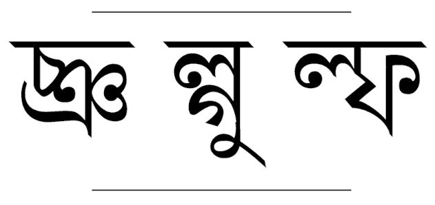
বাংলায় যুক্তাক্ষর চেহারায় তিন ধরনের — এক ধরনের জোড়া-হরফ থেকে বোঝা যায় না নিহিত হরফগুলো কী, যেমন ক্ষ; এগুলো মণ্ড-হরফ বা অস্বচ্ছ হরফ; আরেক ধরনের জোড়া-হরফ থেকে নিহিত হরফগুলোর খানিকটা বোঝা যায়, যেমন ঞ্জ; এগুলো অর্ধস্বচ্ছ হরফ; আর বাকি ধরনের জোড়া-হরফ থেকে সহজেই বোঝা যায় নিহিত হরফগুলো অস্তিত্ব, যেমন ল্ক; এগুলো স্বচ্ছ হরফ। বাংলায় ছাপা শুরুর অনেক পরে, ১৯২০ সালের দিকে বাংলা টাইপরাইটার আসা থেকে শুরু করে ১৯৩৬ সালে লাইনোটাইপ আসা পর্যন্ত অনেক আলোচনাই হয়েছে জোড়া-হরফের সরলীকরণ বা স্বচ্ছ রূপ নিয়ে। অনেক হরফ স্বচ্ছ হয়েছেও। গেল শতকের সাতের দশকের শেষ এবং আটের দশকের শুরুর দিকে পবিত্র সরকার জোড়া-হরফকে স্বচ্ছ করার পরামর্শ দেন। কালক্রমে স্বচ্ছ জোড়া-হরফ অনেকটা গৃহীত হয়, পশ্চিমবঙ্গ এবং বাংলাদেশ দুই জায়গায়ই, বিশেষত ছোটোদের পাঠ্যপুস্তকে। বাংলাদেশের পাঠ্যপুস্তক বোর্ডে একটা আলাদা ফন্ট ব্যবহার করে স্বচ্ছ হরফ ছাপার জন্য; পশ্চিমবঙ্গ বাংলা আকাদেমিও এমন একটি ফন্ট তৈরি করেছে। বাংলাদেশের স্কুলের পাঠ্যপুস্তকে অনেকগুলো জোড়া-হরফই স্বচ্ছ। পশ্চিমবঙ্গে বাংলা আকাদেমি এবং সাহিত্য সংসদ এখন সাধারণত স্বচ্ছ হরফে বই ছাপে।
এমনই একটি মণ্ডিত জোড়া-হরফ হল ষ্ণ—ষ + ণ; অনেকে এখনও ধারণা করেন যে এটি আদতে ষ + ঞ, জোড়া-হরফের পিঠের বোঁচকা দেখে। ১৯৫৬ সালে ‘প্রবাসী’ পত্রিকায় ছাপানো শুভেন্দুশেখর মুখোপাধ্যায়ের লেখা পড়ে ধারণা করা যায় ষ + ঞ-এর ভ্রান্তি তখনও ছিল। এর থেকে উত্তরণের উপায় হিসেবে প্রস্তাব করা হয় ণ-টিকে বোঁচকা হিসেবে না লিখে, নীচে ফলা হিসেবে লেখার। বিদ্যাসুন্দরের এক পুথিতেও এমনটি চোখে পড়ে — ‘ছাতি তৃষ্ণায় ফাটে না দেয় কেহো পাণি’। এখানে ষ-এর নীচে ণ, রুগ্ণ-তে গ-এর নীচে ণ যেমন। একটি সমস্যা অবশ্য থেকেই যায় — নীচের ফলাটি দন্ত্য ন নাকি মূর্ধন্য ণ-এর সেটা বোঝা যায় না, ঠিক যেমন বোঝা যায় না রুগ্ণ বানানে; এখনে ফলাটি মূর্ধন্য ণ-এর। সেটারও একটা সুরাহা হতে পারে। লাইনোটাইপে যেমন বামদিকে ওপরে ছোটো ষ ছাপা হয়, তার ডানে প্রমাণ আকারের ণ দিলেই এ-সমস্যা আর থাকে না। তবে বাঙালির চোখ আর কলমে তা সহজে আসবে কি?
Bengali conjuncts can be of three types. It is difficult to tell the constituent letters in one of them such as ক্ষ, or kṣa, which is known as the opaque or non-transparent type. The other type shows the constituent letters in part such as ঞ্জ, or ñja, which is semi-transparent. Constituent letters show their faces, in reduced form perhaps, in the third type of conjuncts such as ল্ক, or lka, which transparent. Many days after the beginning of Bengali printing, the issue of conjunct simplification or transparent conjuncts had been in discussion from the 1920s when Bengali typewriter was devised till about 1936 when Bengali printing with Linotype machines was introduced. Many conjuncts did become transparent. Pabitra Sarkar proposed the simplification of opaque conjuncts towards the end of the 1970s and in the beginning of the 1980s. Transparent conjuncts later started to be gaining ground, both in West Bengal and Bangladesh, especially in textbooks for children. Pashchimbangla Bangla Akademi even designed a font that featured transparent conjuncts. School textbooks in Bangladesh are mostly printed in transparent conjuncts. Bangla Akademi and Sahitya Samsad in West Bengali also print books using transparent conjuncts.
One opaque conjunct that is conjoined beyond recognition is ষ্ণ, or ṣṇa — ṣa + ṇa. Many even today believe that the constituent letters are ষ, or ṣa, and ঞ, or ña, purportedly from the two bundles, typical of ঞ or ña, that the conjunct carries piggyback. An article by Shubhendushekhar Mukhopadhyay published in a 1956 issue of the Prabasi magazine suggests that people then also had such a flawed understanding. One way to dispel the confusion was to write ণ, or ṇa, as a subjoined element with the shape unchanged, not as bundles saddled on the back of the conjunct. A Vidyasundar codex has an example of such subjoining where it says — chāti tr̥ṣṇāẏa phāṭe nā deẏa keho pāni (ছাতি তৃষ্ণায় ফাটে না দেয় কেহো পাণি) — the way ṇa is subjoined with ga in the word rugṇa (রুগ্ন). Yet, the subjoined element does not make any distinction between the dental na, or ন, and the retroflex ṇa, or ণ — a case evidenced only in the word rugna and its derivatives. There is, perhaps, a way out. It could be written with a small ষ, or ṣa, as is the case with Linotype style, and a standard-sized ণ, or ṇa, ligated sideways. Will it be unpleasant to write and see?
১৮ই আগস্ট ২০২১ | 18 August 2021
গেল শতকের আটের দশকের শেষ এবং নয়ের দশকের শুরুর দিকে বাংলা হরফ যখন কম্পিউটারের যুগে প্রবেশ করে, ডস বা ডিস্ক অপারেটিং সিস্টেম পেরিয়ে তখন উইন্ডোজের যুগ, পুরোপুরি না হলেও। বাংলায় একের পর এক সফটওয়্যার বের হতে শুরু করল। প্রতিটির আলাদা আলাদা হরফ-ভাঁড়ার (character repertoire) এবং তাঁদের আলাদা রকম সাজ। হরফ-ভাঁড়ারের এই সজ্জার একটা ইংরেজি নাম আছে, encoding। এত এনকোডিঙের ভিড়ে লেখা হারিয়ে যাওয়ার দশা। সবারই নিজের নিজের টাঁকশালে বানানো টাকা, কিন্তু কোনোটিই একচেটিয়া বাজারে চলছে না। এক সফটওয়্যার দিয়ে লেখা অন্য সফটওয়্যার দিয়ে পড়াও যাচ্ছে না। বাংলায় তখন যেমন এনকোডিঙের সমস্যা ছিল, আন্তর্জাতিক পরিমণ্ডলে সমস্যাটি তখন ছিল কোড পেজের — কোড পেজ অর্থাৎ কয়েকটি এনকোডিঙের সমাহার যা দিয়ে বেশ কয়েকটি লিপিতে লেখা যায়। নয়ের দশকের শুরুর দিকে, ডসে তখন কোড পেজ ৪৩৭। ভাঁড়ারে হরফের মোট জায়গা ২৫৬। কিন্তু সাধারণভাবে ১২৮টির বেশি ব্যবহার করা যায় না; তারও পুরোটা নয়। এই ১২৮টি হরফের সমাহারই হল আস্কি—American Standard Code for Information Interchange বা মার্কিন সূচনা অন্তরবিনিময় সংহিতা মান। এর আরেকটা নাম ISO/IEC 646। পরে পরিবর্ধিত আস্কির ১২৮টি হরফ জুড়ে ২৫৬টি। সাত-বিটের আস্কি আট-বিটে উত্তীর্ণ হয়ে হল আন্সি—American National Standards Institute বা মার্কিন জাতীয় মান সংস্থার মান। মোটা দাগে আন্সি মানে যা আস্কি নয়। উইন্ডোজে এল উইন্ডোজ ১২৫২ বা কোড পেজ ১২৫২। এটি আবার ISO 8859-1 Latin-1 বা আমাস (আন্তর্জাতিক মান সংস্থা) ৮৮৫৯-১ লাতিন-১ কোডপেজের সুপারসেট। এর সবগুলোরই ছিল রকমফের। বেশ কয়েকটি কোড পেজ নিয়ে ইউরোপের লিপির জন্য উইন্ডোজ গ্লিফ লিস্ট ৪ নামের একটি কোড পেজ তৈরি করা হয়, তার হরফ-ভাঁড়ারে ৬৫৭টি জায়গা।
এ-অবস্থায় ইউনিকোড কনসোর্টিয়াম এনকোডিং এবং কোডপেজ একীভূত করার প্রয়াস নিয়ে প্রতিষ্ঠিত হয় ১৯৯১ সালে। একটি বেসরকারি প্রতিষ্ঠান যা আন্তর্জাতিক মান সংস্থার সঙ্গে কাজ করে। কোড পেজ ৪৩৭, কোড পেজ ১২৫২ বা আমাস ৮৮৫৯-১-এর ক্ষেত্রে কোড পেজের বাইরের লিপিগুলোর জন্য কোড পেজে নির্দিষ্ট হরফের জায়গায় অন্য লিপির হরফের ছবি ব্যবহার করা হত। কম্পিউটারে বাংলা আ, দেবনাগরীর আ (आ) আরবির আলিফ (ا), রুশের আ (А) বা গ্রিকের আলফা (Α) যাই থাকুক না কেন, কম্পিউটার হরফগুলোকে হয়ত লাতিন এ (A) হিসেবে পড়ত। ইউনিকোডের কাজ হল প্রতিটির লিপির প্রতিটি হরফকে কম্পিউটারে হরফ হিসেবে চেনানো, হরফের ছবি হিসেবে নয়। মোদ্দা কথা একটি কোড পেজে প্রতিটি হরফের একটি অনন্য মান নির্ধারণ করে দেওয়া যেন এক কস্পিউটার বা সফটওয়্যারের লেখা অন্য সব কম্পিউটার বা সফটওয়্যার পড়তে পারে। ১৯৯১-এর অক্টোবরে প্রকাশিত ইউনিকোডের প্রথম সংস্করণে ২৮,০০০টি হরফের মান নির্ধারিত হয়। এই ইউনিকোড মানের আরেকটি নাম ISO/IEC 10646। এর ত্রয়োদশতম সংস্করণে (২০২০-এর মার্চ) মান নির্ধারিত হরফের সংখ্যা ১৪৩,৮৪৯; একশত চুয়ান্নটা লিপি থেকে। ২০২১-এর সেপ্টেম্বরে এর চতুর্দশতম সংস্করণ বেরোনোর কথা আছে।

ইউনিকোডের হরফের যে-মান, তা কেবল লেখার যৌক্তিক ক্রম নির্ধারণের জন্য, অর্থাৎ কম্পিউটার তাকে কীভাবে লিখে রাখবে বা পড়বে তার জন্য। হরফের চেহারা কেমন হবে, কোন হরফের আগে বা পরে কোন হরফ থাকবে যেমনটা অভিধানে থাকে, কিংবা কিবোর্ডের কোন চাবি চেপে কোন হরফ লেখা হবে, তা ইউনিকোডের বিষয় নয় একেবারেই। অনেক ভাষার ক্ষেত্রে, যেমনটা বাংলায় বা ইন্দীয় যেকোনো ভাষায়, ইউনিকোডে মূল হরফের ভাঁড়ারে জায়গা কিন্তু ১২৮টি। এবার কোন হরফে জুড়ে চেহারা কেমন হবে, জোড়া-হরফের বা ব্যঞ্জন-স্বরবর্ণের জোড়া সাধারণভাবে কী রূপ নেবে, বিকল্পে কী রূপ নেবে বা আদৌ নেবে কি না, তার ছবিগুলো (glyph) থাকতে পারবে ব্যক্তিগত ব্যবহারের জায়গায় (private use area) এবং সে-জায়গাটা এত বড়ো যে সেখানে হরফের সমস্ত রূপ এবং বিকল্প সহজেই এঁটে যায়। ইউনিকোডে সবচেয়ে বড়ো সুবিধে হল একের লেখা অন্যে পড়তে পারে, এক বার লেখা হলে পড়তে কখনোই সমস্যা হয় না আর আন্তর্জালে সহজেই লেখা যায়। অবশ্য সব সফটওয়্যারে ইউনিকোড ঠিকমতো ব্যবহার করতে এখনও বেশ সময় লেগে যাবে।
১১ই আগস্ট ২০২১ | 11 August 2021
ঢাকার যানজটে রাস্তায় দাঁড়িয়ে একটি সিএনজি বা অটো-রিকশা। গায়ে হলুদ-সাদার ওপর লাল রঙে লেখা—মিফ্তাহুল জান্নাত। শব্দবন্ধটি আরবি ( مفتاح الجنة), অর্থ বেহেশত বা স্বর্গের চাবি। প্রথম শব্দটি, যার অর্থ চাবি, তা বাংলা হরফে সাধারণত হসন্ত-সহ এবং হসন্ত-ছাড়া দু-ভাবেই লেখা হয়। কিন্তু অটো-রিকশার গায়ের লেখায় একটি নতুন জোড়া-হরফ, ওপরে ফ এবং নীচে ত। এরকম জোড়া-হরফ ছাপায় অন্তত দেখা যায়নি; সিসার টাইপে তো নয়ই, লাইনোটাইপের সময়েও নয়, এমনকী আজকের ইউনিকোডের জমানায় যখন অনেক বাংলা ফন্টে এ-ধরনের একটি জোড়া-হরফ রাখা আছে, তখনও নয়।
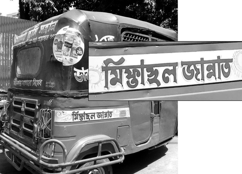
১৯৮৮ সালে সেইফওয়ার্ক্স নামে ঢাকার একটি কোম্পানি বাংলা লেখার জন্য ডস বা ডিস্ক অপারেটিং সিস্টেমে ব্যবহারের একটি সফটওয়্যার তৈরির কাজ শুরু করে। সফটওয়্যারটি বর্ণ নামে বাজারে আসে ১৯৯০ সালে। ডসে বাংলা লেখার জন্য এটিই সম্ভবত প্রথম পূর্ণাঙ্গ সফটওয়্যার। এতে তিন ছাঁদের বাংলা এবং তিন ছাঁদের রোমান হরফ ছিল; মেনুও ছিল বাংলায়; সঙ্গে চার ধরনের কিবোর্ড বিন্যাস। সফটওয়্যারটির হরফের ভাঁড়ারে ফ + ট বলে একটি জোড়া-হরফ ছিল—খানিকটা ছোটো ফ-এর ওপরে ট-এর চৈতন আর ফ-এর নীচে থেকে ডানে বেরিয়ে থাকা ট-এর বাকিটা। যাঁরা সফটওয়্যারটি তৈরি করেছিলেন তাঁরা কেবল ‘সফটওয়্যার’ শব্দটি জোড়া-হরফ দিয়ে লিখবে বলেই জোড়া-হরফটি তৈরি করেছিলেন। সফটওয়্যারটি বর্ণনা নামে উইন্ডোজের অ্যাড-অন হিসেবে বাজারে আসে ১৯৯৫ সালে; সেখানেও জোড়া-হরফটি ছিল। এখন অবশ্য আলাদা-আলাদা ফ এবং ট দিয়ে সফটওয়্যার লেখাই দস্তুর।
An auto-rickshaw is caught in traffic on a road in Dhaka. The body of the auto-rickshaw sports a phrase, written in red on a background of yellow and white, reading ‘miftahul jannat’— miphtāhula jānnāta. This is an Arabic phrase (مفتاح الجنة), which means ‘the key to heaven.’ The first word of the phrase, which means ‘key’, is customarily written in the Bengali script with a hasanta or without. But the phrase as written on the body of the auto-rickshaw shows a new conjunct letter, with a half-the-size pha (ফ) above and a half-the-size ta (ত) below. We do not come by such a conjunct in print, not in hot-metal types and not even in types as employed in Linotype printing. This does not exist even now in the days of Unicode when many fonts around may have such a conjunct designed within.
A software firm called Safeworks, of Dhaka, started developing a program called Barna on DOS, or the Disk Operating System, in 1988, to write Bengali. The program started selling in 1990. This was, perhaps, the first fully-fledged software to write Bengali, offering Bengali face of three styles and Roman face of three styles. Its menu was in Bengali, too. It shipped with four keyboard overlays. The software had a conjunct letter, pha (ফ) + ṭa (ট), in its character repertoire — a small pha with a full-sized ṭa, intersecting in the middle. The developers said that they designed the conjunct only to write the word ‘software’ (saphṭaoẏẏāra). The software had its Windows port as an add-on renamed as Barnana in 1995. The pha + ṭa conjunct is still there in many fonts although writing it with a pha + hasanta + ṭa is largely the norm now.
২রা আগস্ট ২০২১ | 2 August 2021
পরিবর্ধিত হরফের ব্যবহার বা হরফ পরিবর্ধনের ঘটনা বাংলায় নতুন নয়। উনিশ শতকের শুরুর দিকে এ-নিয়ে কথাবার্তা শুরু হয়। জ্ঞানেন্দ্রমোহনের বাঙ্গালা ভাষার অভিধানে হরফের নীচে বিন্দু বা ফুটকি দিয়ে বিদেশি ভাষার ধ্বনি বোঝানো হয় ১৯১৭ সালে। ১৯৩৬-এ এসে কলিকাতা বিশ্ববিদ্যায়লের বানান রীতির বদৌলতে জ-এর নীচে ফুটকি একটি বিধিবদ্ধ ব্যাপারে দাঁড়িয়ে গিয়েছে। এর প্রচলনে বুদ্ধদেব বসুর অবদানও কম নয়। আনন্দবাজার পত্রিকায় জ-এ ফুটকি একটি নৈমিত্তিক ব্যাপার; দেশ পত্রিকায় এর শুরুটা হয়েছিল গেল শতকের শেষের দিকে। আধুনিক ইউনিকোডের বুকনিতে এর নাম অবশ্য নুকতা, এবং তা হরফ পরিবর্ধনের জন্যই।
কিন্তু এরও বেশ আগে, উনিশ শতকের মাঝামাঝিতে, ১৮৫১ সালে কলকাতায় ছাপানো জন মেন্ডিসের ‘কম্প্যানিঅন টু জনসন্স ডিকশনারি: বেঙ্গলি অ্যান্ড ইংলিশ’ (Companion to Johnson’s Dictionary: Bengali and English) বইয়ে এই হরফ পরিবর্ধনের একটি উদাহরণ দেখতে পাওয়া যায়। কলিকাতার ব্যাপ্টিস্ট মিশন প্রেসে ছাপানো মেন্ডিসের অভিধানের একটি উল্লেখ করার মতো বিষয় হল আরবি-ফারসি থেকে আসা শব্দে জ এবং জ় ধ্বনির বানানে পার্থক্য নির্দেশ – জ-এর নিচে দুই ফুটকি দিয়ে, যেমন, আজিজ এবং আজিম শব্দে এর দেখা মেলে। এই ক্ষেত্রে জ্ঞানেন্দ্রমোহন এবং সুনীতিকুমার চট্টোপাধ্যায়ের নিয়ম এক বিন্দু। এরও বছর তিরিশেক আগে শ্রীরামপুরের ব্যাপ্টিস্ট মিশন প্রেস থেকে ছাপানো হয় বাইবেলের অসমীয়া অনুবাদ। ১৮২০ সালে ছাপানো ধর্ম্মপুস্তক নামের এই বইয়ের তিনের পাতায় বলা আছে কোনো স্বরবর্ণের নীচে ফুটকি থাকলে তা আরবির আইনের (ع) মতো, খ-এর নীচে থাকলে তা আরবির খা-এর (خ) মতো, স-এর নীচে থাকলে তা আরবির সোয়াদের (ص) মতো এবং ক-এর নীচে থাকলে তা আরবির কাফের (ق) মতো উচ্চারিত হবে।
বাংলা ছাপায় হরফ পরিবর্ধনের এত পুরানো উদাহরণ দেখতে পাওয়া যায় না, অথচ ব্যাপ্টিস্ট মিশন প্রেসের ছাপায়, যদিও অসমীয়ায়, এর প্রচলন ছিল। উনিশ শতকের শুরুতে শ্রীরামপুরে ছাপানো আরও কতক বাংলা বই হাতে পেলে ব্যাপারটি আরও ভালোভাবে বোঝা যেত।
Script extension is nothing new to Bengali. The issue came into discussions as the 19th century began. Under-dot letters were used in Bangala Bhashar Abhidhan (A dictionary of the Bengali language), by Jnanendramohan Das, published in 1917, to flag foreign sounds. The spelling regulations of the University of Calcutta, published in 1936, almost normalised the use of under-dot ‘ja’. Buddhadev Bose played a role in making the issue noticed. It became an everyday affair at the hands of Anandabazar Patrika, with Desh having started using the extended letter ‘under-dot ja’ towards the end of the past century. This under-dot is known as nukta in Uncode and is meant to extend letters.
But much before this, the Companion to Johnson’s Dictionary: Bengali and English by John Mendies, published from Calcutta in 1851, employed two under-dots with ‘ja’ to distinguish the z-sound from the j-sound in words such as ‘aziz’ (poor, helpless) and ‘azim’ (honourable, respectable), coming from Persian and Arabic. Jnanendramohan Das and Sunit Kumar Chatterji both held a brief for a single dot below the letter in the cases in example. But about three decades before Mendies’ work, the Assamese translation of the Bible, Dharmma Pustak, published by the Baptist Mission Press at Serampore in 1820, on page 3 says that any Bengali vowels with an under-dot would signify Arabic ‘ayn (ع), with ‘kha’ would signify Arabic k͟hā (خ), with ‘sa’ would signify Arabic ṣād (ص) and with ‘ka’ would signify Arabic qāf (ق) in pronunciation.
Examples of script extension as old as this in Bengali have not yet been noticed although people at the Baptist Mission Press extended the script with under-dots, in Assamese though. A look at more Bengali books printed towards the beginning of the 19th century could be a good pointer to Bengali script extension in old times.
২৬শে জুলাই ২০২১ | 26 July 2021
বিচল হরফে বাংলা ছাপার শুরুতেই আপাত দৃষ্টিতে কিছু জোড়া-হরফ তৈরি হয়ে আবার ঝরে পড়েছে। এরকম একটি হরফ হল ত্য। এর দেখা মেলে নাথানিয়েল ব্র্যাসি হ্যালেডের ১৭৭৮ সালে ছাপা বাংলা ব্যাকরণ বইয়ে। ধারাবাহিক ছাপা দেখলে মনে হয় একসময় এটি নিয়মে দাঁড়িয়ে গিয়েছিল যে প্রয়োজন পড়লেই জোড়া-হরফ বানানো হবে, বিশেষত বাংলা হরফে সংস্কৃত বা বাংলায় ব্যবহৃত সংস্কৃত শব্দ ছাপানোর জন্য। বিশ শতকের গোড়ার দিকে হরফ সংখ্যা কমানোর একটা তাগিদ দেখা যায়, প্রথমে টাইপরাইটারে বাংলা ব্যবহারে জন্য, পরে ছাপাখানার কেসের ঘর কমানোর জন্য এবং আরও পরে বাংলা লাইনোটাইপের জন্য। টাইপরাইটারে বাংলা লেখায় জোড়া-হরফের তেমন কোনো গতি করা যায়নি; ছাপাখানার কেসেও ঘরের সংখ্যা কার্যত কমানো যায়নি; তবে লাইনোটাইপে সংখ্যাটি অনেকটা নামিয়ে আনা গিয়েছিল। গেল শতকের আট বা নয়ের দশকে কম্পিউটারে বাংলা লেখার সময়ও হরফ কমানোর একটা প্রচেষ্টা ছিল; তবে সেটা জোড়া-হরফের সংখ্যা কমানোর জন্য নয়, বরং সাবেকি চেহারার জোড়া হরফ কী করে অল্প সংখ্যক হরফচিত্র বা glyph দিয়ে লেখা যায়, তার। ইউনিকোড আসার পর আমরা আবার বিশ শতকের আগের দিকে উলটো যাত্রা করেছি জোড়া-হরফ বিষয়ে, কারণ ইউনিকোডের একটি ফন্টে হাজার হাজার হরফ বা হরফচিত্র রাখা সম্ভব।
এই ডামাডোলের মাঝে ভালোভাবে টিকে গিয়েছে যে জোড়া-হরফটি তা হল চ-য় ঞ—চ্ঞ। শুরুর দিকে ওপরে চ এবং নীচে ঞ ছাপা হয়েছে; ওপরে ছোটো আকারের চ ঘেঁষে নীচে ছোটো ঞ ছাপা হয়েছে; ওপরে ছোটো চ এবং তার গা ঘেঁষে বড়ো ঞ ছাপা হয়েছে; প্রমাণ মাপের চ এবং ঞ গায়ে গা লাগিয়ে ছাপা হয়েছে; আবার চ-এ হসন্ত দিয়ে আলাদা ঞ-ও ছাপা হয়েছে। কিন্তু বাংলায় এই জোড়া-হরফ দিয়ে প্রচলিত শব্দ একটিই—যাচ্ঞা। ল্গু তেমনই আরেকটি স্বরবর্ণ-সহ জোড়া-হরফ—ল + হসন্ত + গ + উ। বাংলা ফাল্গুন আর ফল্গু এবং এই দুই শব্দ থেকে আরও গুটিকতক সাধিত শব্দ ছাড়া আর কোথাও ল্গু-এর ব্যবহার নেই। পুরানো অনেক বইয়ে ফাল্গুন এবং ফল্গু হিসাবে ছাপা হয়েছে। ল্ফ-এর ক্ষেত্রেও তাই; গুল্ফ ছাড়া আর কোনো শব্দ চোখে পড়ে না এবং শব্দটি গুল্ফ হিসাবেও লেখা যায়। বাংলা ব্যাকরণের নিয়মে কোনো ব্যঞ্জনের পরে হসন্ত হলে পরের ব্যঞ্জনের সঙ্গে তা জুড়ে গিয়ে জোড়া-হরফ তৈরি করে, তা সে জুড়েই লিখি, হরফের মণ্ডিত চেহারায় লিখি বা হসন্ত দিয়ে। এই তিন জোড়া-হরফের চেহারা বাংলা লিপির জন্য বয়ে বেড়ানো কি আদৌ প্রয়োজন? ব্যবহৃত ফন্টে কিংবা একই আদলের আলাদা ফন্ট ফাইলে জোড়া-হরফ তিনটি অবশ্যই থাকবে এদের পুরানো চেহারায় ছাপানোর জন্য, কিন্তু আধুনিক লেখায় ছাপা হবে না। ছাপা হবে না শিশুদের বইয়েও।
Some conjunct forms that came in print in the initial days of Bengali moveable types have ceased to exist. An example of such a conjunct is ‘tya’ (ত্য), found in A Grammar of the Bengal Language, by Nathaniel Brassy Halhed, which came out in 1778. Successive Bengali prints suggest that it was once customary to devise conjunct letters to print Sanskrit or Sanskrit words used in Bengali. As the twentieth century began, there had been some efforts to cut down on the number of letters for typewriters made in the twenties. Efforts could also be noticed to reduce the number of letters in type-cases of printing presses and to make a small letter repertoire for Linotype machines. Conjunct letters could not be adequately dealt with for the typewriter. The number of letters, or sorts, for printing presses could not also be reduced either. But the number of letters and symbols could be adequately brought down for Linotype printing. When Bengali computing began in the 1980s–1990s, efforts were still there to reduce the number of letters, but that conjunct letters were not in focus. Efforts were made so that the traditional, hot-metal face could be rendered using a minimum number of glyphs. After Unicode had arrived, we embarked on a journey towards what letters looked like before the twentieth century. There was, and is, no dearth of spaces in a Unicode font, which can hold thousands of letters or glyphs.
The Bengali conjunct c+ña (চ্ঞ), however, survived the times. In the beginning, it was a half-the-standard size ca (চ), with a smaller than half the size ña (ঞ), joined together downwards to the right; a small ca and a small ña, joined together downwards to the right; a small ca and a ña of the standard size ligated sidewise; and even a full-form ca and ña, ligated together. A ca with a hasanta (halanta) followed by a ña could also be found in print. All this is only for a single word in Bengali — yācñā (যাচ্ঞা), meaning ‘the act of seeking.’ The conjunct of lga + u-kar (ল্গু) — la + hasanta + ga + u-kar — is another sort, or letter, with a small la above, and an old-style gu, rounded at the bottom, joined below. The letter can be found only in two words — phālguna (ফাল্গুন) and phalgu (ফল্গু) and some other words derived from the two. Old books have the cluster printed with a hasanta, such as phāl:guna (ফাল্গুন) and phal:gu (ফল্গু). The conjunct of lpha — la + hasanta + pha — is found in the word gulpha (গুল্ফ), the only example of the cluster, which again can be printed as gul:pha (গুল্ফ). The grammar of Bengali lays out that any involcalised consonant forms a conjunct with the following consonant, irrespective of being ligated, conjoined beyond recognition or written with a hasanta. Should the script system of Bengali still retain the three conjuncts? The conjuncts could be there in the font at hand or in other fonts of the same weight and face for printing text the way it was printed in old times, but they should not be used in modern writing and certainly not in books for children.
২১শে জুলাই ২০২১ | 21 July 2021
ইউনিকোডে বাংলা লেখার বাল্যকালে ইউনিকোড কনসোর্টিয়াম একটি নিয়ম বেঁধে দিয়েছিল বাংলা ইলেক চিহ্ন (’), অর্থাৎ ঊর্ধ্বকমা বা লুপ্তি চিহ্নের জন্য। ইউনিকোডের মান তখন ৫.২.০, অর্থাৎ ২০০৯-এর অক্টোবর থেকে। এতদিন বাঙালি হাতের লেখায় বা ধাতব ছাপায় তো বটেই, এমনকী আস্কি বা আন্সি নির্ভর করেও ইলেক চিহ্ন বলতে শেষের একক উদ্ধার চিহ্নের ব্যবহার করে এসেছে। দেখতে বা বুঝতে মানুষের সমস্যা তেমন একটা হত না, এখনও হচ্ছে না। কিন্তু ইউনিকোড কনসোর্টিয়ামের মতে, বাংলায় ইলেক চিহ্ন হল একইরকম দেখতে অন্য একটি চিহ্ন, যার পোশাকি নাম ‘modifier letter apostrophe’ এবং তার অনন্য পরিচয়জ্ঞাপক নম্বর হল 02BC।
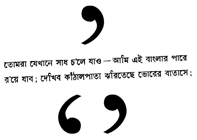
বস্তুত, শেষের উদ্ধার চিহ্নের ব্যবহারে, উদ্ধারের শুরুর চিহ্নের একটা আকাঙ্ক্ষা থাকে। এটিই হয়তো যৌক্তিক। কিন্তু প্রচলিত ইউনিকোড বাংলা ফন্টে এই চিহ্নের অনুপস্থিতি বেশ ঝামেলাকর। না জানার ফলে এবং বেশ বাধ্য হয়েই লোকে উদ্ধার চিহ্ন দিয়েই লুপ্তি চিহ্নের কাজ সারছে। সমস্যা থেকে যাচ্ছে এই যে ভবিষ্যতে বৈদ্যুতিন মাধ্যমে বা ভাষাংশের গবেষণায় আমরা হয়তো ‘তোমরা যেখানে সাধ চ’লে যাও– আমি এই বাংলার পারে র’য়ে যাব’ খুঁজে যাব, কম্পিউটার খুঁজে পাবে না। কম্পিউটার হয়তো এ-ও বলতে পারে যে উদ্ধার চিহ্নের শেষেরটা আছে, শুরুরটা কোথায়? বাঙালির ‘বর্ণপরিচয়’ ১৮৫৫-য় শুরু হয়েও তার চিহ্নপরিচয় এখনও শেষ হল না।
The Unicode Consortium laid out a rule for the mark of elision, which looks like the apostrophe, when the standard ran to version 5.2.0 in October 2009. The Bengalis have almost always used the right single quotation mark as the mark of elision, not only in handwritten text and hot-metal print but also in systems that used ASCII and ANSI encoding. The use of single quotation mark for any letter elided in words has so far posed no problem, but the Unicode Consortium says that the mark of elision in Bengali is what Unicode formally calls the modifier letter apostrophe, with its unique assignment of 02BC, which looks like the right single quotation mark that is used as the apostrophe in English.
The use of a single right quotation mark singly warrants a single left quotation mark somewhere before it. This appears logical. But the modifier letter apostrophe is absent from almost all Unicode Bengali fonts, compounding the situation and confounding users. People, mostly out of ignorance or being compelled with no other option in hand, keep using the right single quotation mark to flag any elision of letters in words. But this leaves us with a problem. We may search for a line from Jibanananda Das’s —তোমরা যেখানে সাধ চ’লে যাও– আমি এই বাংলার পারে র’য়ে যাব (Go wherever you want, I’ll stay back by the banks of Bengal) — on the web or in corpora, but either nothing will return because of the mismatch or the computer might ask back for the left single quotation mark. We are on an unending journey through marks, signs and symbols that we started with the Bengali primer that Ishwarchandra Vidyasagar published in 1855.
১৬ই জুলাই ২০২১ | 16 July 2021
দেবনাগরী লিপিতে লেখা হয় সংস্কৃত, হিন্দি, মরাঠি, এমনকী নেপালিও। আঠেরো শতকের চারের দশকে প্রথম বিচল দেবনাগরী হরফ তৈরি হলেও, সেটা ছিল ইতালিতে। বঙ্গভূমিতে বিচল দেবনাগরী হরফ ঢালাই প্রথম সম্ভবত ১৭৮৯ সালে নিউ এশিয়াটিক মিসেলানিতে (The New Asiatic Miscellany), দেবনাগরী হরফে সংস্কৃত এবং রেখতার উদাহরণ ছাপার জন্য। উইলিয়াম কার্কপ্যাট্রিকের জন্য লন্ডনে বানানো জোসেফ জ্যাকসনের হরফ কলকাতায় ব্যবহৃত হয় কার্কপ্যাট্রিকের হিন্দি ব্যাকরণের একটি ছোটো অংশ ছাপানোর জন্য, ১৭৯৯ সালে। ইতিমধ্যে সরকারি তত্ত্বাবধানে আরও এক সাট দেবনাগরী হরফ কাটা হয় ১৭৯৩ সালে। এই হরফ ক্যালকাটা গেজেটে ব্যবহার করা হয় ১৭৯৬ সালে। এর আগে চার্লস উইলকন্স এবং পঞ্চানন কর্মকারের হাতে বাংলা বিচল হরফ উঠে এসেছিল ১৭৭৮ সালে নাথানিয়েল ব্র্যাসি হ্যালেডের বাংলা ব্যাকরণ ছাপানোর জন্য। জানা যায়, ১৮০৩ সালে শ্রীরামপুরের ব্যাপ্টিস্ট মিশন প্রেসের ঢালাইখানায় এক সাট দেবনাগরী হরফ কাটা হয়। এই সাটে ১৮০৫ সালে ব্যাপ্টিস্ট মিশন প্রেস থেকে সন্ত মাতিউর মরাঠি অনুবাদ এবং উইলিয়াম কেরির মরাঠি ব্যাকরণ ছেপে বের হয়।
তবে কলকাতার পর মুম্বই হয়ে ওঠে দেবনাগরীতে ছাপার কেন্দ্র, প্রথমে লিথোগ্রাফিতে এবং পরে বিচল হরফে। কালে বেশ কয়েকটি হরফের চেহারা এবং জোড়া-হরফ লেখার ধরন আলাদা হতে থাকে কলকাতা এবং মুম্বইয়ের ছাপার মধ্যে। মুম্বইয়ের আমেরিকান মিশন প্রেসে হরফের ধরন পালটায় এলাইজা ওয়েবস্টার এবং টমাস গ্রাহামের হাতে, সেই শতকের তিনের দশকে। আধা হরফ বা হিন্দিতে যা ‘আধে অক্ষর’ (आधे अक्षर), তা দিয়ে জোড়া-হরফের ধরন সহজ করা হয়। এতে অবশ্য গ্রাহামের শিষ্য গণপত কৃষ্ণজি এবং জাবজি দাদাজির অবদান আছে।
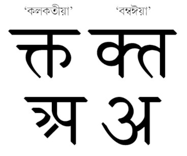
সেই থেকে দেবনাগরী হরফের ছাঁদ দুই ধরণের — ‘কলকতীয়া’ বা কলকাতার ছাঁদ এবং ‘বম্বঈয়া’ বা মুম্বইয়ের ছাঁদ। প্রথমটি ধ্রুপদী বা উত্তরী ছাঁদের, অন্যটি আধুনিক বা দক্ষিণী ছাঁদের। আদতে একটি স্বরবর্ণ (অ) এবং চারটি ব্যঞ্জনবর্ণে (ঝ, ণ, ল এবং শ) লক্ষ করার মতো ফারাক। কলকাতার ছাঁদের অ-টি দেখতে খানিকটা দেবনাগরীর প-এর মতো, সামনে তিনটি শুঁড় আর মুম্বইয়ের ছাঁদের অ-টি বাংলার ও-এর মতো, সঙ্গে জোড়া-লাগানো দাঁড়ি। সেই থেকে আ, ও এবং ঔ-ও আলাদা। আরও কয়েকটি হরফের ধাঁচে খানিক পার্থক্য আছে। দু-টি সংখ্যার (৫ এবং ৮) ধরনেও রয়েছে ফারাক। আর, জোড়া-হরফের লেখার ধরন বেশ আলাদা। জোড়া-হরফে ক + ত কলকাতার ছাঁদে একবারেই মণ্ড হরফ আর মুম্বইয়ের ছাঁদে ক এবং ত পাশাপাশি জোড়া-লাগানো। অনেকটা বাংলার সাবেকি চেহারার সিসার টাইপের ক্ত (সমাত্রিক ত্ত-এর ডানে আঁকড়ি) যেমন আলাদা লাইনোটাইপের ক্ত (ওপরে ক এবং নীচে ত) থেকে।
Devanagari is employed to write Sanskrit, Hindi, Marathi and even Nepali. The first moveable Devanagari type was cast in the forties of the eighteenth century. But that was in Italy. It was, perhaps, in 1789 when Devanagari type was first cast in Bengal. It was to print examples of Sanskrit and Rekhta in The New Asiatic Miscellany. Joseph Jackson cast a Devanagari typeset in London for William Kirkpatrick and it was used in Kolkata in 1791 to print a small portion of William Kirkpatrick’s Hindvi grammar. Another Devanagari typeset had already been cast, meanwhile, under the government supervision in 1793. The typeset was used in the Calcutta Gazette in 1796. Charles Wilkins and Panchanan Karmakar had by then cast a set of moveable Bengali types for A Grammar of the Bengal Language by Nathaniel Brassey Halhead in 1778. Panchanan Karmakar cast a Devanagari typeset at the foundry of the Baptist Mission Press at Serampore in 1803, which was employed in the printing of William Carey’s translation of St. Matthew and A Grammar of the Marhatta Language that Carey wrote.
After Kolkata, Mumbai became the centre of Devanagari types, first in lithography and then in moveable types. In the course of time, a few characters changed their appearance; some conjuncts also started to be cast in a way different from what was the norm in Kolkata. The changes were accomplished by Elijah Webster and Thomas Graham at the American Mission Press in Mumbai. The conjunct characters employed half-letters, or adhe akshar (आधे अक्षर) as they are called in Hindi. Ganpat Krishnaji and Javji Dadaji who apprenticed themselves to Thomas Graham had a role in this.
Since then, Devanagari came to be designed, or cast, in two styles: ‘Kalkatīyā’, or the Kolkata style, and ‘Bambaīyā’, or the Mumbai style. The Kolkata style was considered classical or northern and the Mumbai style modern or southern. Marked differences are evident in the first letter of the alphabet, the vowel a, and four consonants, jha, ña, la and śa. The Kolkata style vowel a looks more like the Bengali a, with a stem added to the right. This also makes Devanagari ā, o and au different. Some other letters and two figures, 5 and 8, are also different. The ways some conjuncts are formed are also different. The conjunct of ka + ta is, for an example, in the Kolkata style, is conjoined beyond recognition, but is, in the Mumbai style, ka and ta ligated sidewise. The difference is something like how ka + ta is cast in traditional hot-metal face, with a head-stroke over o and an arm with a blob protruding to the right, and how it is cast in Linotype, with half-the-standard-size ka and ta, placed one above another.
১০ই জুলাই ২০২১ | 10 July 2021
আজ আমরা কম্পিউটারে লেখালিখির সময়ে মুখ্যত ইউনিকোড ব্যবহার করি বটে, কিন্তু দু-এক দশক আগেও তা ছিল আস্কি (ASCII) বা আন্সির (ANSI) যুগ। তখন কম্পিউটারে হরফের তালিকার কোনো এক জায়গায় আমরা বাঙালিরা ‘অ’ রাখছি, আরবিভাষীরা হয়তো সেখানেই রাখছে ‘আলিফ’ (أ); কিন্তু সেই জায়গাটা আদতে হয়তো লাতিন a-র জন্য নির্ধারিত। ফলত বাবেলের টাওয়ার, এখানে আর কথায় নয়, লেখায়! এই সমস্যার সমাধানে এগিয়ে এল ইউনিকোড কনসোর্টিয়াম, ১৯৯১-এর জানুয়ারিতে, একটি ফন্টে পৃথিবীর যাবতীয় হরফের প্রতিটির জন্য অনন্য এক জায়গা নির্ধারণের প্রয়াস নিয়ে। প্রথম দিকে বাঙালির প্রিয় খণ্ড-ত (ৎ) সরাসরি লেখা যেত না। প্রয়োজনও হয়তো ছিল না। ত (09A4) + হসন্ত (09CD) + শূন্য প্রস্থের অযোজক (200C) হল গিয়ে খণ্ড-ত। ইউনিকোড মানের প্রথম সংস্করণে এইটিই ছিল খণ্ড-ত লেখবার নিয়ম। পরবর্তীকালে খণ্ড-ত-ও কোডের তালিকায় জায়গা করে নেয়। ইউনিকোডের মান তখন ৪.১.০; সেটা ২০০৫ সালের মার্চ মাস।
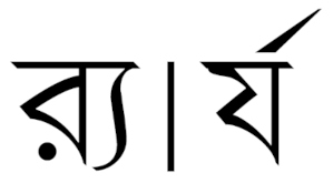
কিন্তু ইউনিকোড এসেও সব সমস্যা কি পুরোপুরি মিটল? অন্তত আমাদের বাংলায়? যেমন, অন্তঃস্থ য-এ রেফ এবং র-এ য-ফলা নিয়ে অনেকদিন পর্যন্ত সমস্যা তৈরি হতে থাকে। পরে সমাধানও এসে পড়ে। য-এ রেফ লিখতে হলে র (09B0) + হসন্ত (09CD) + য (09AF) লিখলেই পাওয়া যাবে র্য। র (09B0) + শূন্য প্রস্থের যোজক (200D) + হসন্ত (09CD) + য (09AF) লিখলে পাওয়া যাবে র্য। এটি ২০০৬ সালের কথা, ইউনিকোডের মান তখন ৫.০। র্য দিয়ে বাংলার তেমন কোনো শব্দ নেই; কেবল বিদেশি ভাষার শব্দেই এর ব্যবহার, যেমন ‘র্যাপার’,আলোয়ান বা গায়ক অর্থে। যদিও সমাধান এসেছে দেড় দশকের অধিক, তবু আজও অনেকে এই সমস্যার মুখে পড়েন। এমনকী, হয়তো এ-লেখা পড়তে গিয়েও আপনার সেই সমস্যাই হচ্ছে! আসলে, কিছু সফটওয়্যারে এখনও ঠিকভাবে র-এ য-ফলা দেখতে পাওয়া যায় না। এটা হয় ফন্টের সমস্যা, নয় সফটওয়্যারের রেন্ডারিং ইঞ্জিনের। বাংলা ইউনিকোড কিন্তু র্য লেখার উপায় বাতলে রেখেছে ঢের আগে।
We chiefly use Unicode to write Bengali these days, but a decade or two ago, this was an affair of ASCII or ANSI. We would, for an example, assign a place in the font to the first Bengali letter 'অ' that Arabic users would to 'alif' (أ) while the place may, in fact, have been meant for Latin 'a'. This resulted in a Tower of Babel, not in spoken words, but in written letters. The Unicode Consortium came forward to our rescue in 1991 by trying to assign a unique place for all letters of the world individually in a single font. Yet, we could not write khanda_ta (ৎ) directly in its initial days; it did not need to be so written, perhaps. Ta (09A4) + hasanta (09CD) + zero-width non-joiner (200C) could make the khanda-ta. This was the way Unicode in its first version provided for khanda-ta, which later earned a place in the code chart. But it was, then, March 2005 and Unicode was in version 4.1.0.
Even then, all problems could not be resolved. Not for Bengali, at least. We had issues writing ya + repha — which is, in fact, repha + ya — and ra + ya-phala; an invocalised ra preceding a canonical ya or an invocalised ra as a canonical character followed by a ya. Solutions followed. Ra (09B0) + hasanta (09CD) + ya (09AF) would make the rya (র্য) and ra (09B0) + zero-width joiner (200D) + hasanta (09CD) + ya (09AF) would make r:ya (র্য). It was in 2006 when the Unicode version was 5.0. Bengali words with r:ya are hard to come by; it is mainly used in loan words, such as r:yāpāra (র্যাপার), which could mean a wrapper or a rapper. Although it has been a decade and a half since the solution came our way, we still have issues with this. Some software are unable to render ra + ya-phala (র্য) properly, because of inadequacy in the font scheme or problems with the rendering engine.
৪ঠা জুলাই ২০২১ | 4 July 20201
Rev.: vii·xi·mmxxii